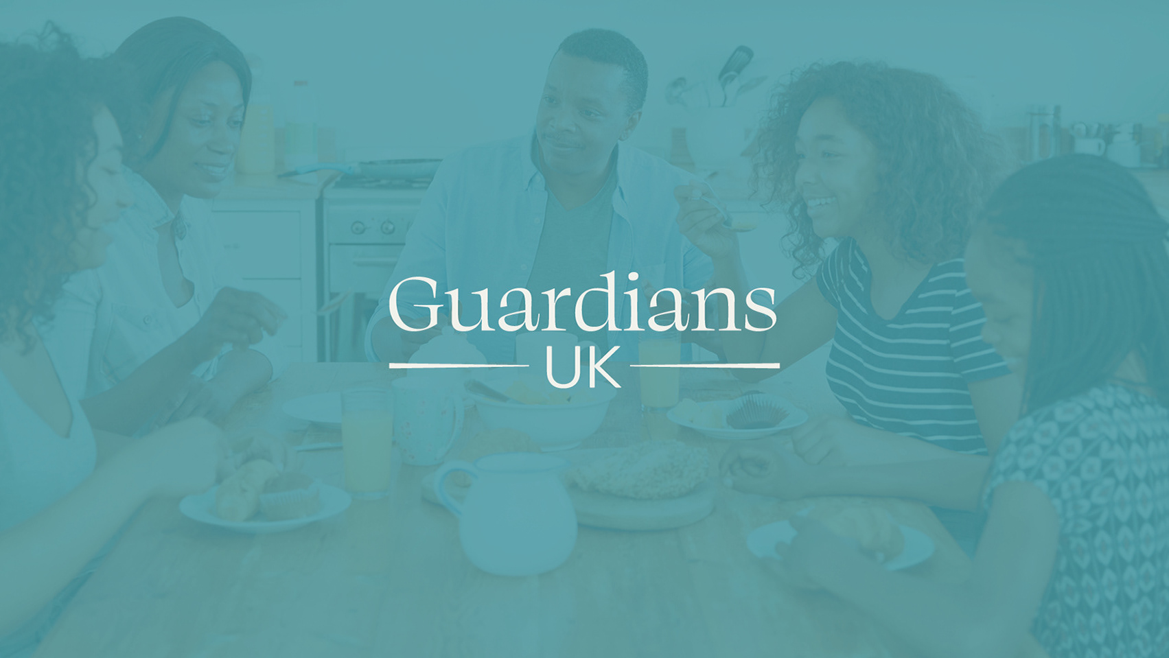
Adding vibrancy and character
to an existing brand to gain supporters and awareness
to an existing brand to gain supporters and awareness
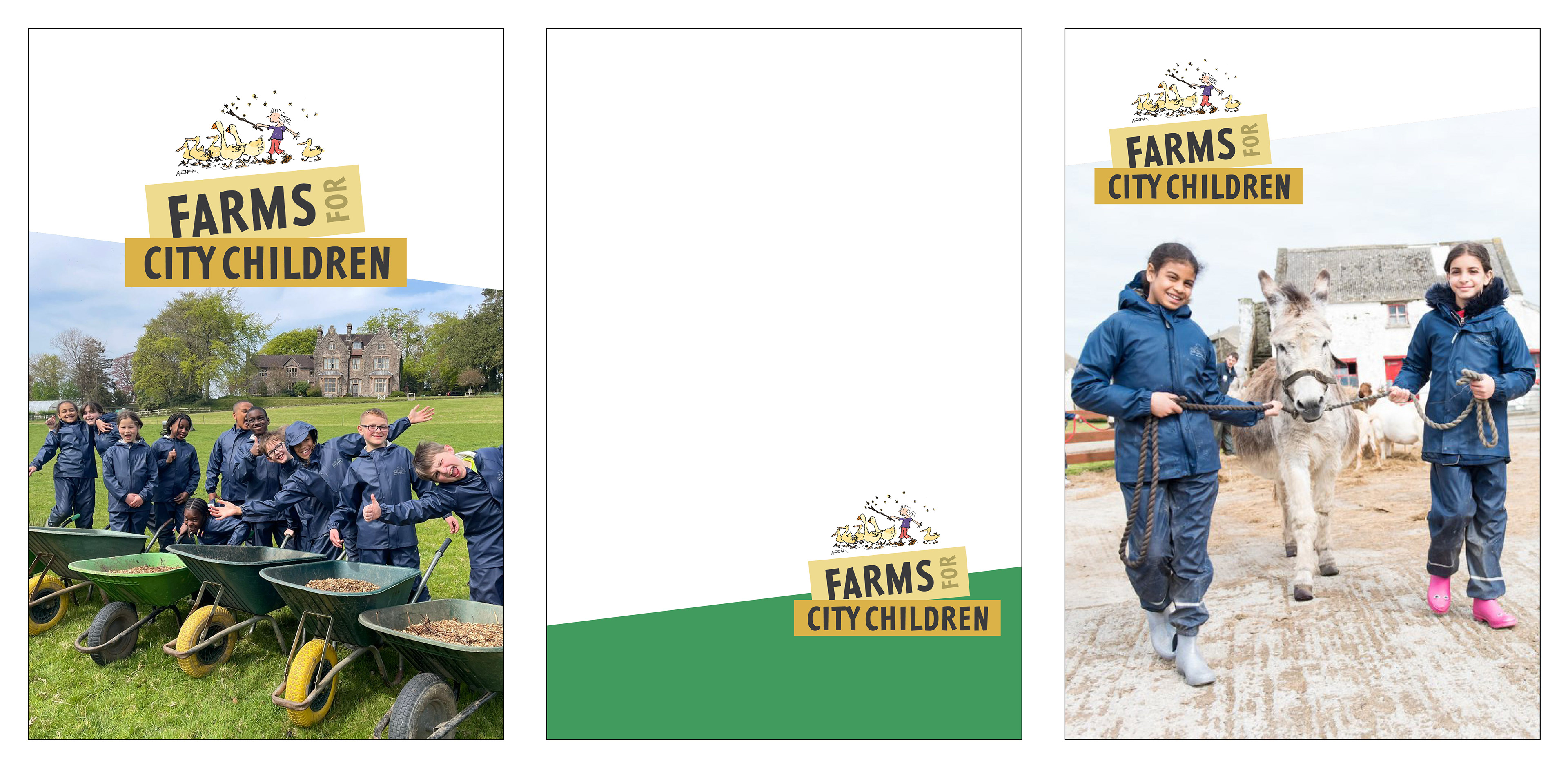
The charity faced a problem that a lot of their materials were uninspiring, slightly too childish and not impactful enough. Alongside this their logo was a hand drawn illustration and when used small, the text couldn't be read.
Keeping the distinctive original illustration I paired bold, characterful type and created a brand style that is playful but yet not to childish - aiming at donors but also beneficiaries and school or youth workers.
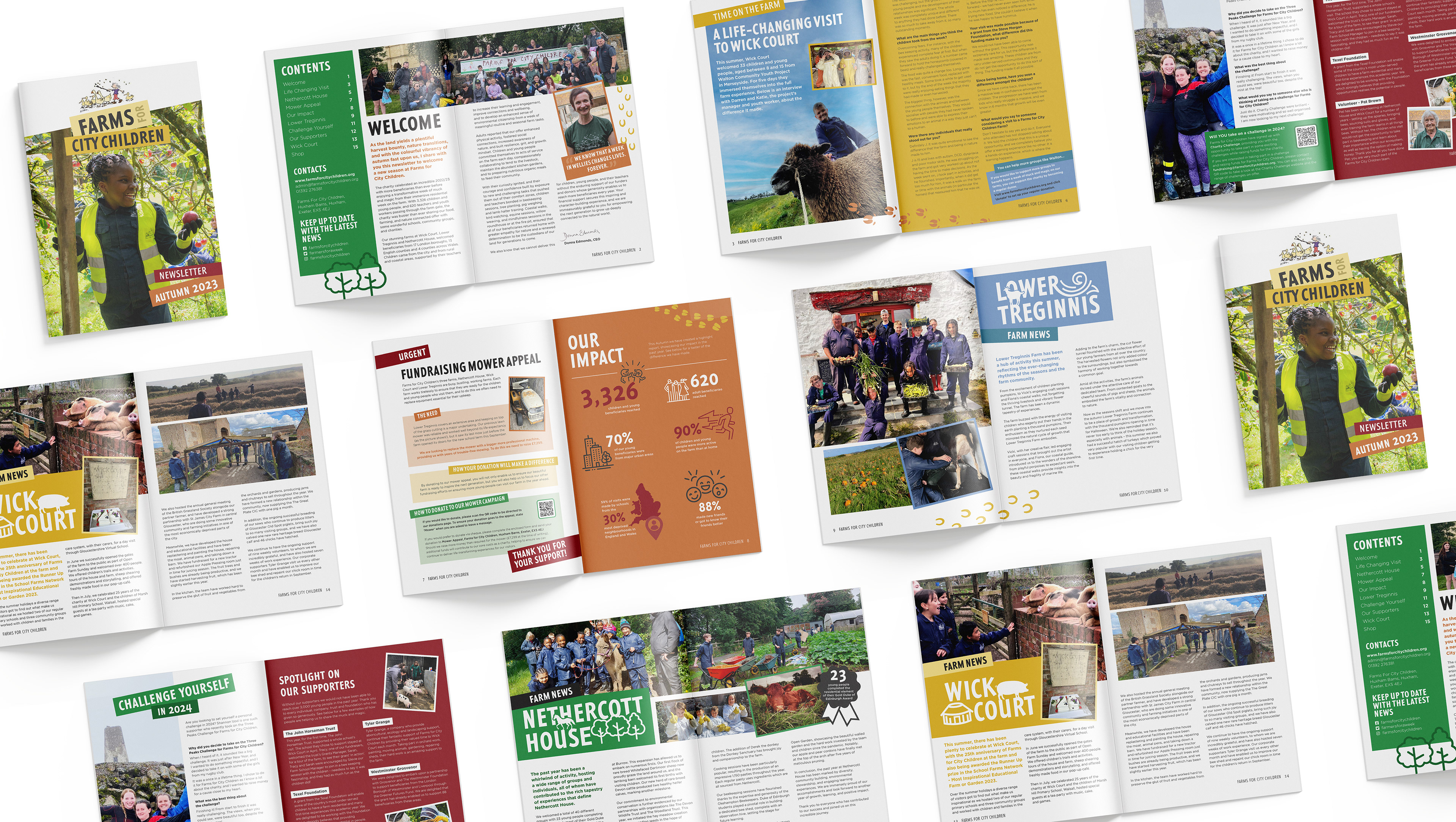
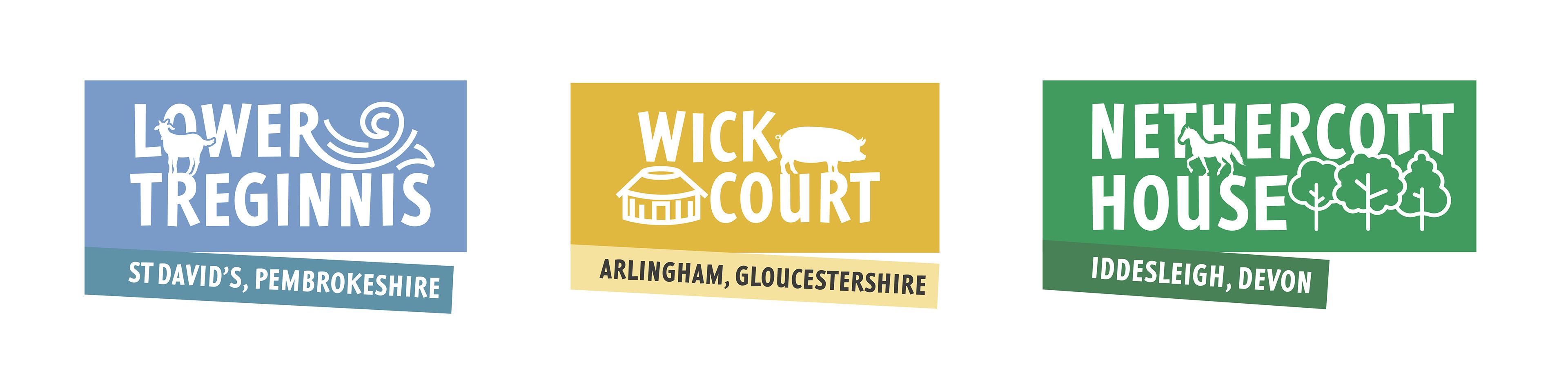
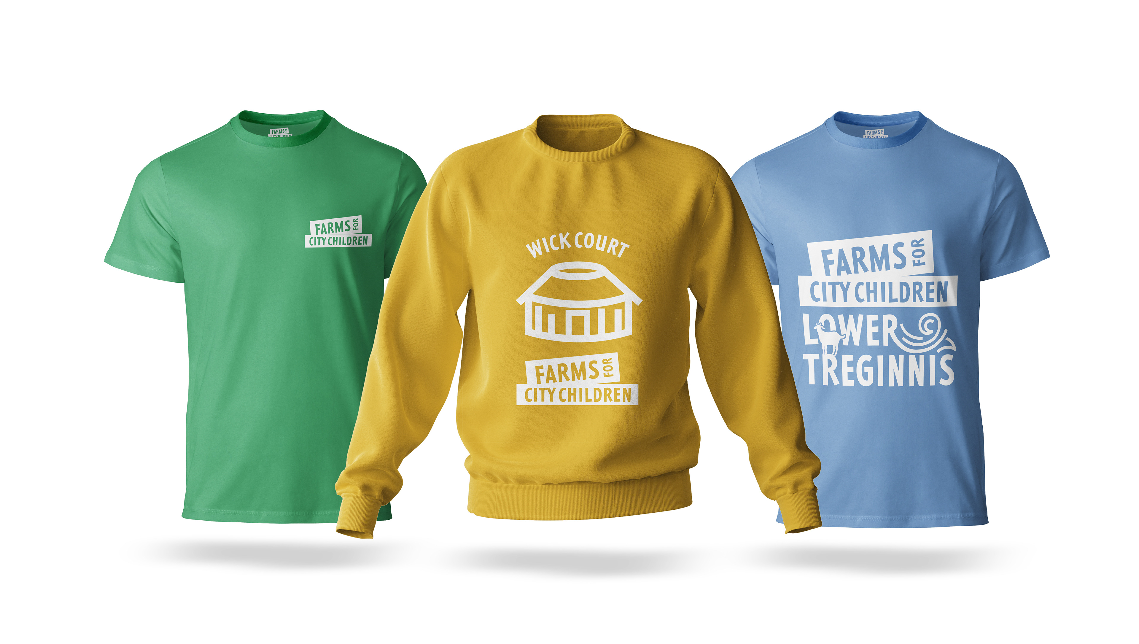
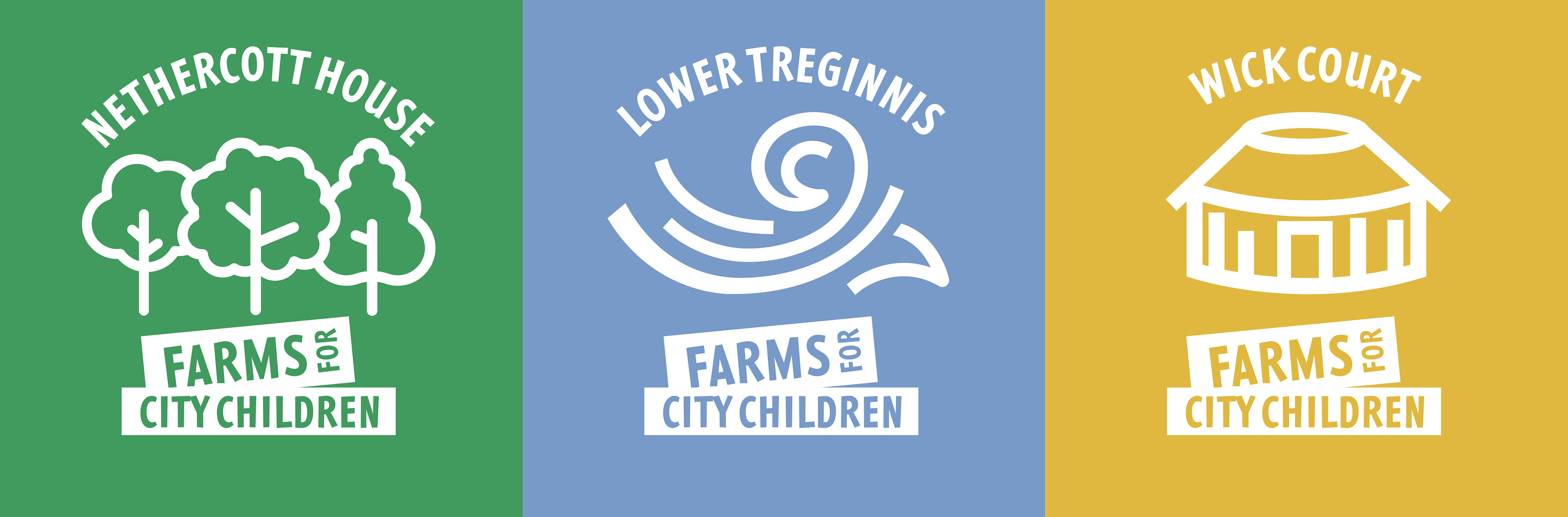
The initial task of creating a newsletter turned onto a whole branding exercise, where each of the three farms gained their own identities to distinguish between separate farm news and highlight each destination's unique features that the beneficiaries could use and be proud to have visited.

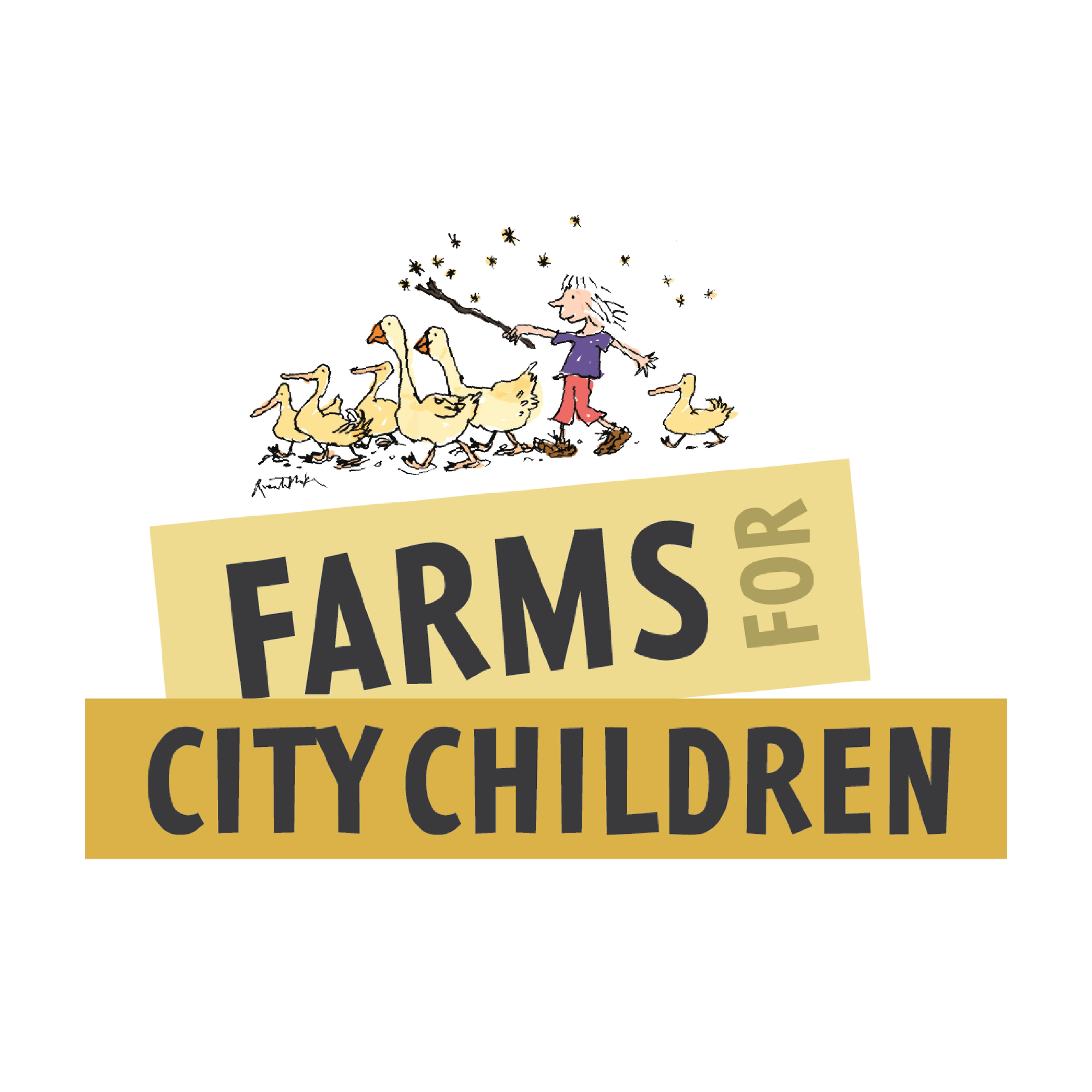

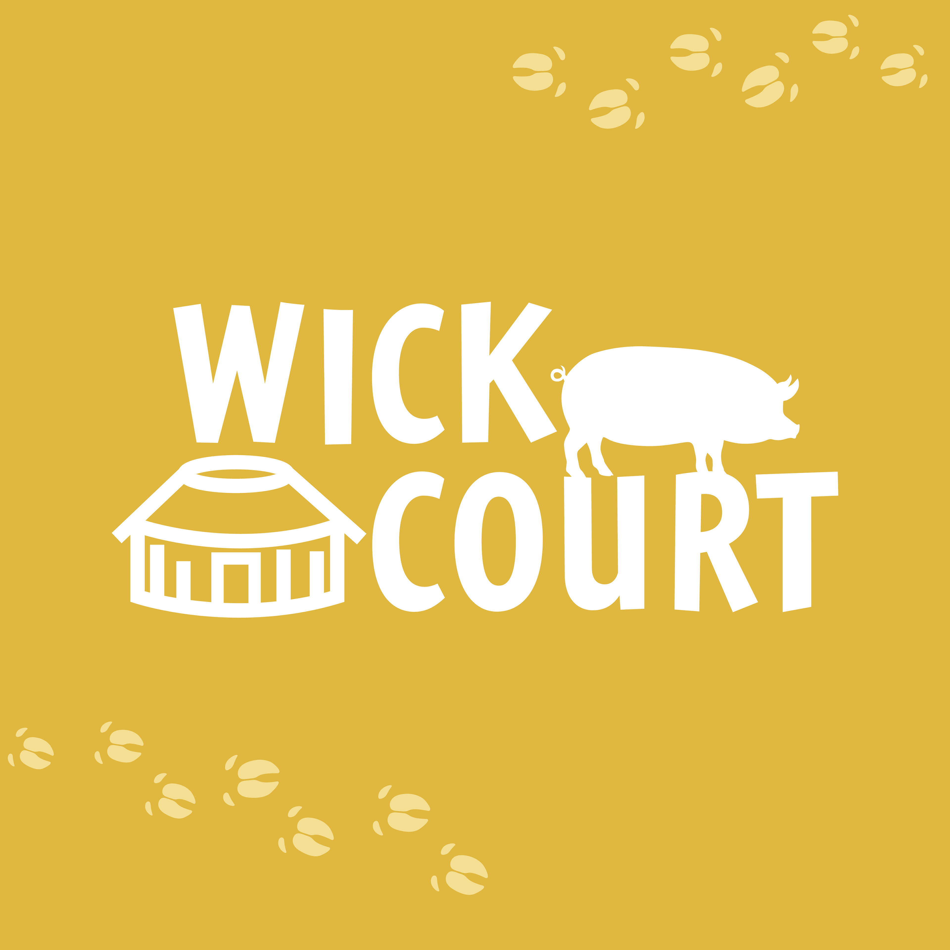
Due to the intricate original Goose drawing the logo works best on a white background however a slanted container can be used to split between the logo text as demonstrated below. This allows imagery to be placed behind the logo while being in keeping with the overall brand. These angles are used throughout the branding and can also be used as page footers.


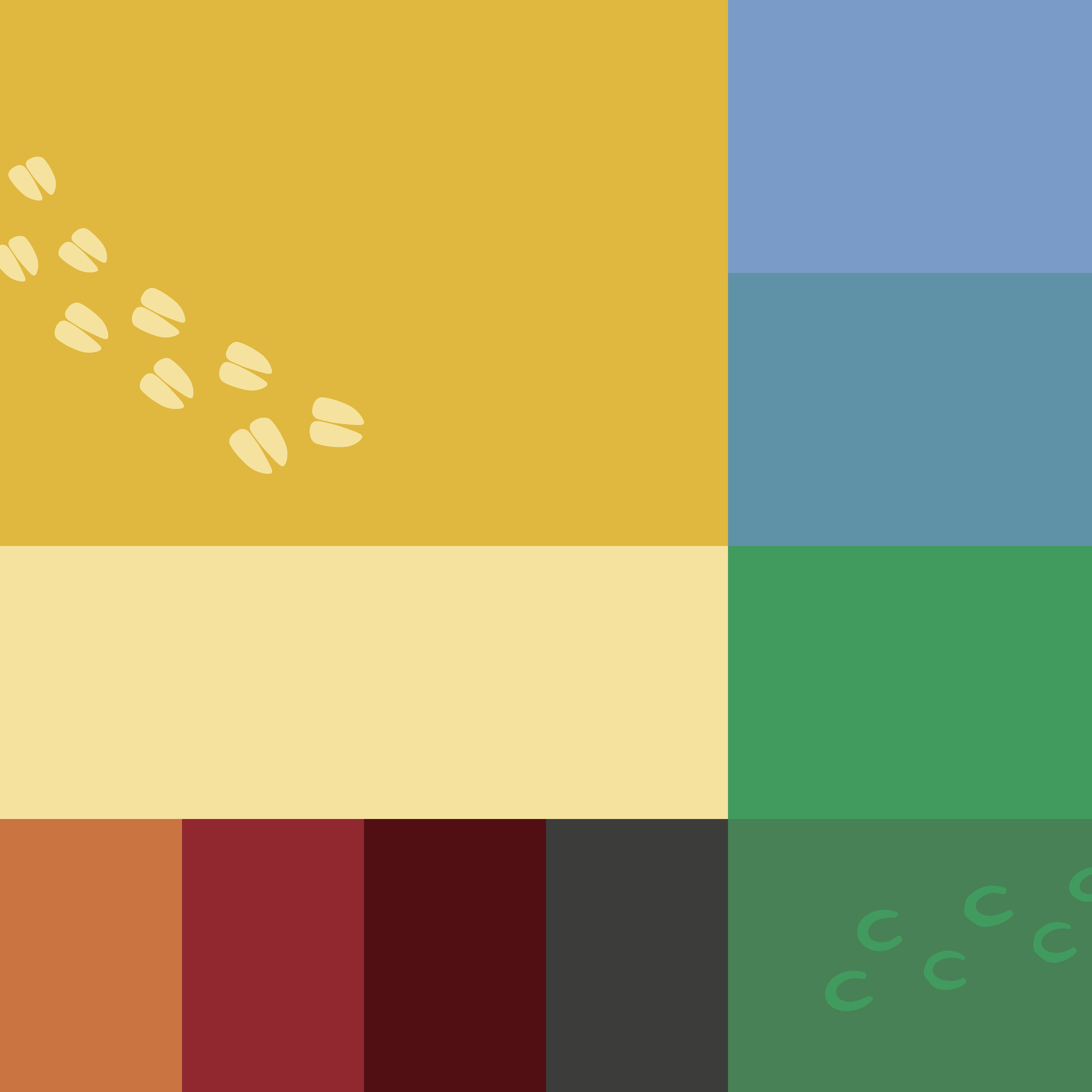
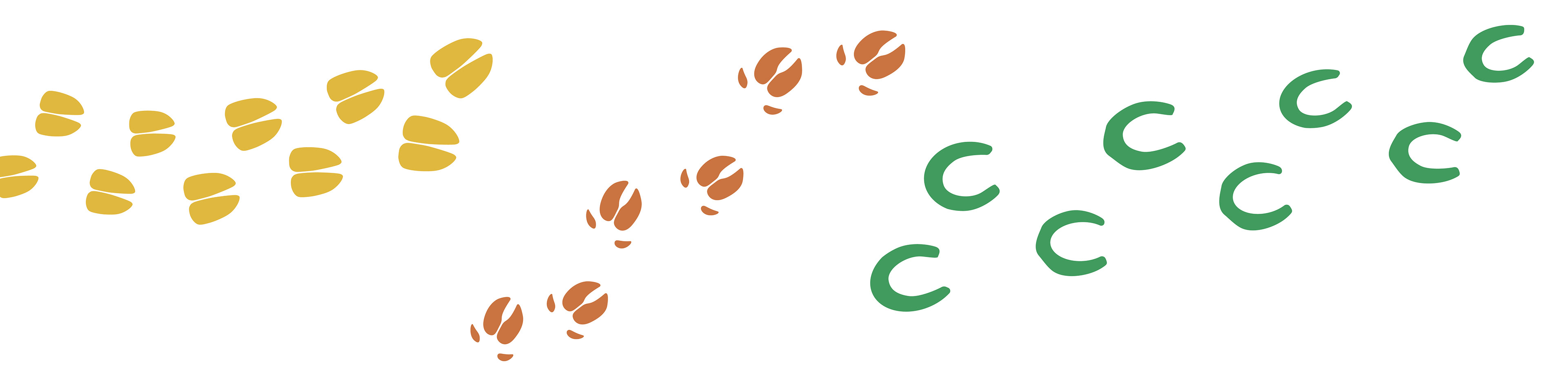
Angled colour blocks became distinctive style for the brand and tonal colour pallet allows for overlaying icons and graphics such as the footprints from animals on the farms.
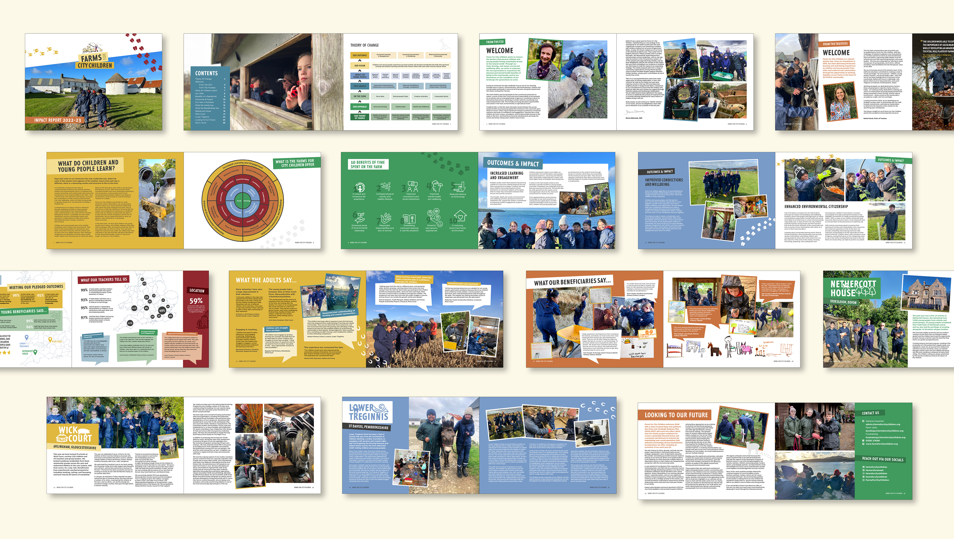
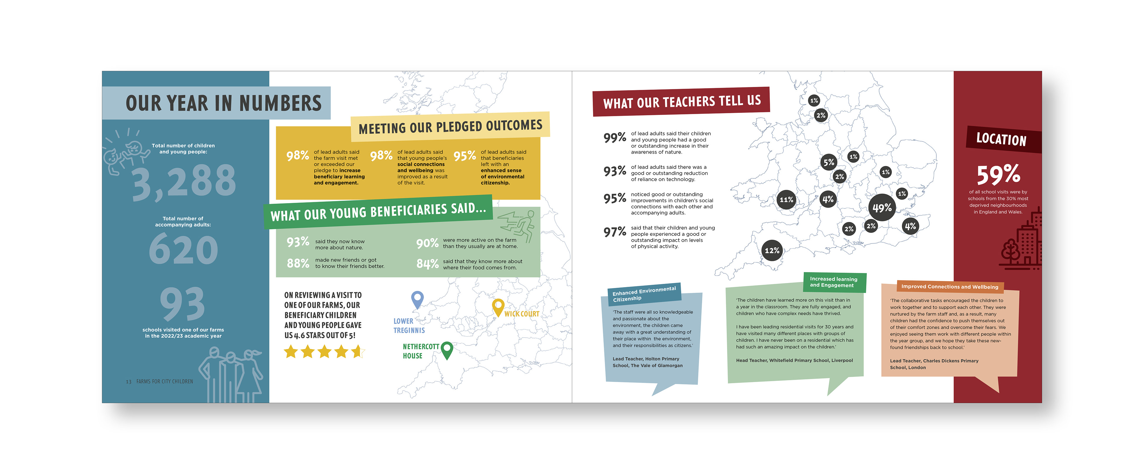
Impact reports, Offer Brochures and bi-annual Newsletters were brought to life with infographics, showcasing the charities work.

Work produced while working at Quantock Design