Designing a brand that heals through connection and massage with a focus on mental health
The client asked me to create a logo and brand for her new business "Soul Time Therapy" which focuses on deep tissue, aromatherapy massage, Indian head massage, hot stones and reflexology while also focusing on those with mental health issues and anxiety.
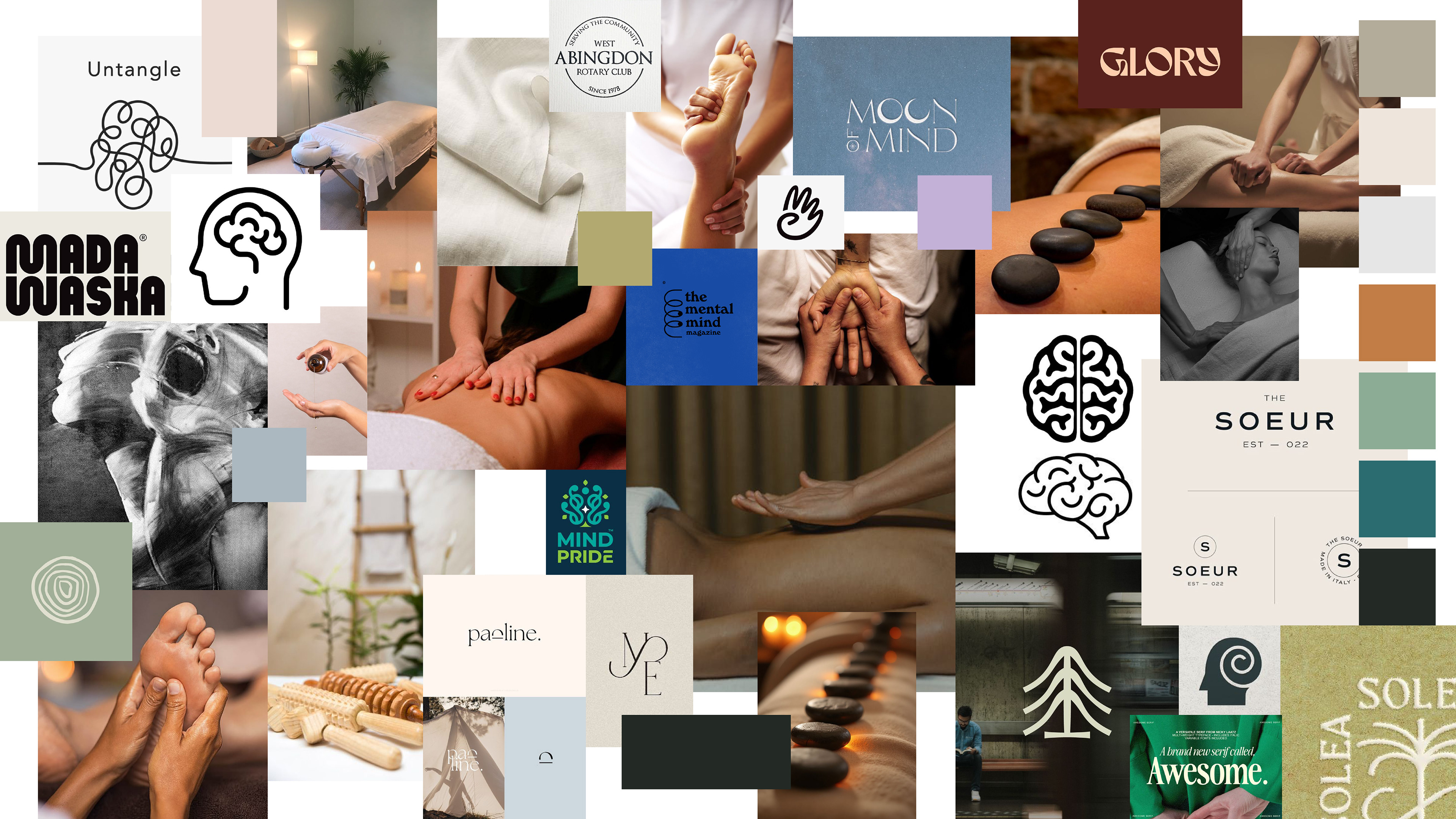
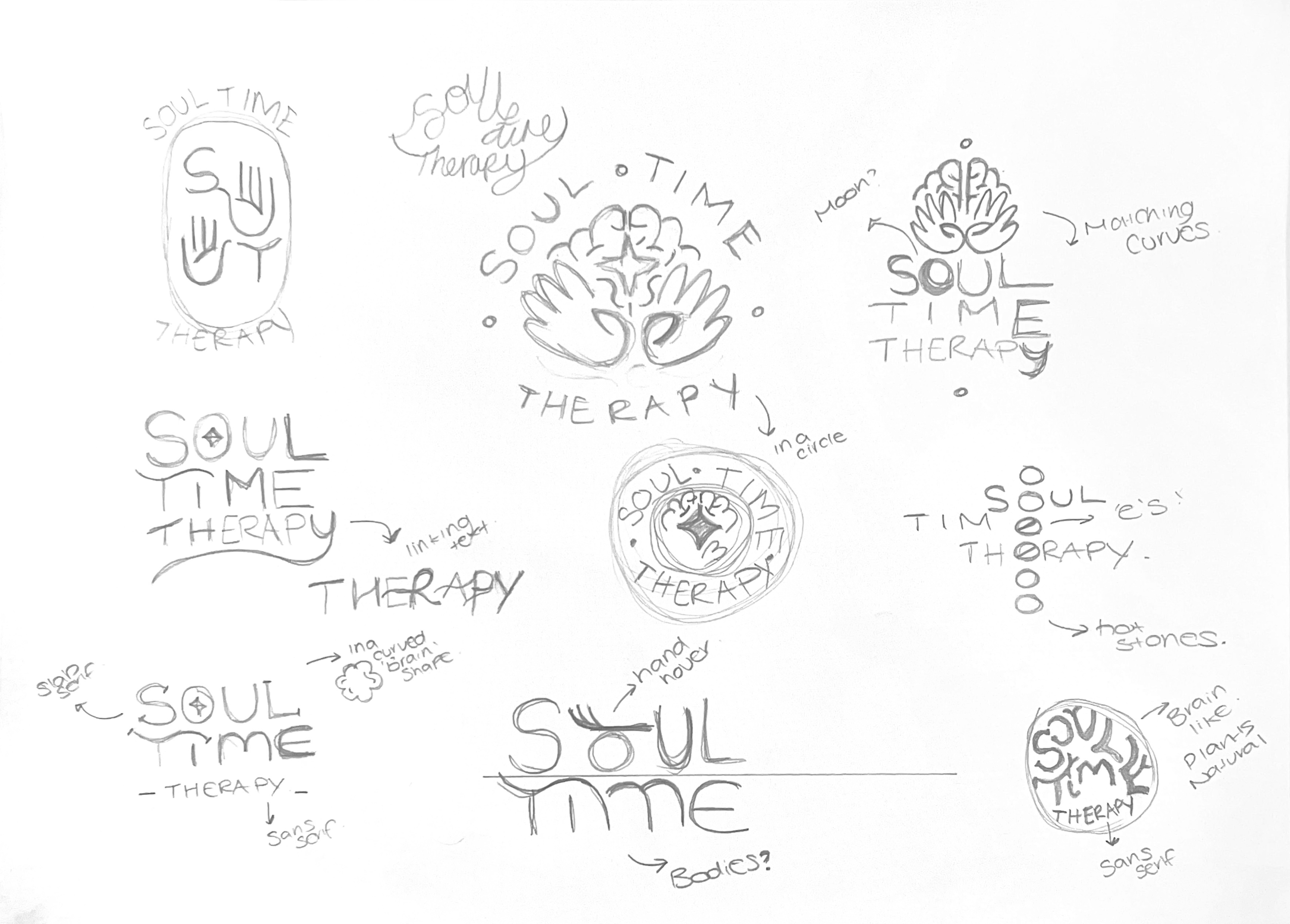
I created an initial moodboard to gauge the clients like's and dislikes and sketched out some initial thoughts to work from.
I created an initial moodboard to gauge the clients like's and dislikes and sketched out some initial thoughts to work from.
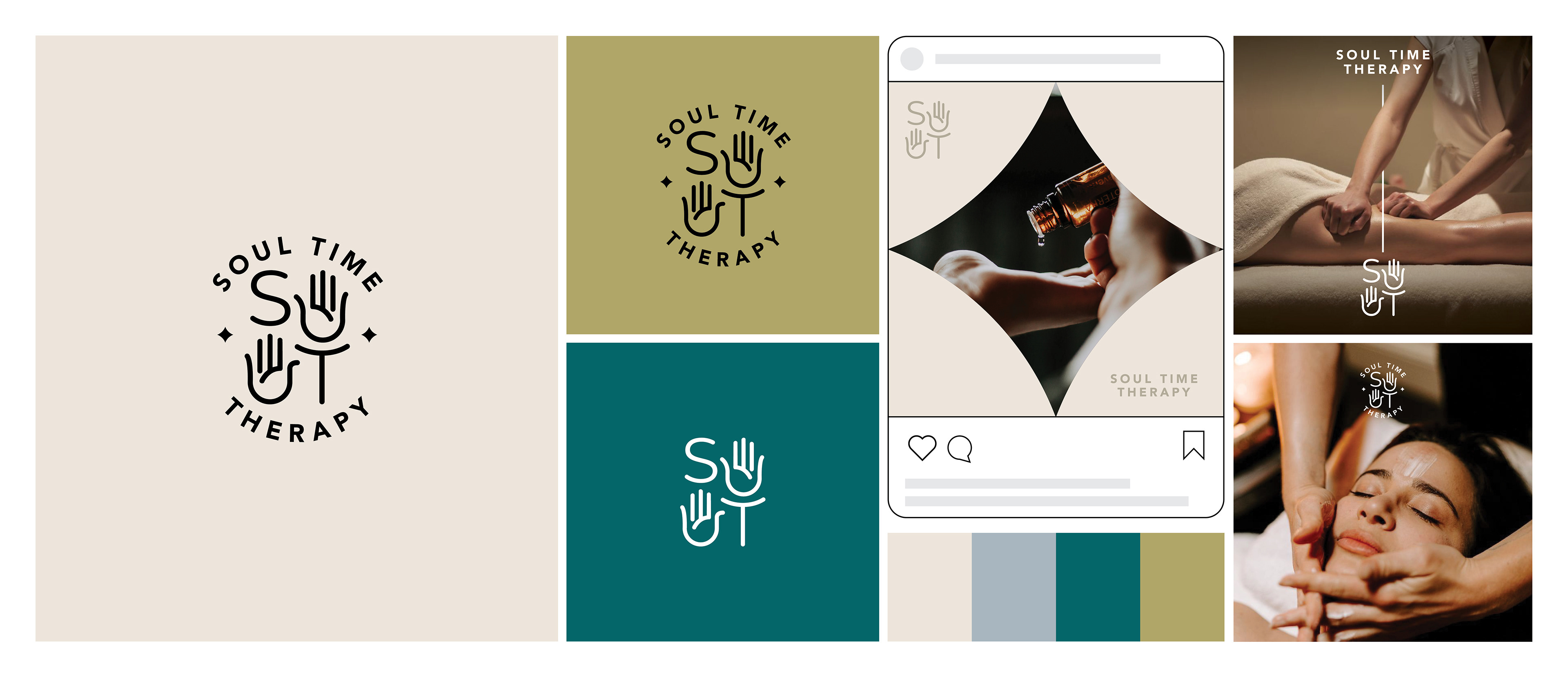
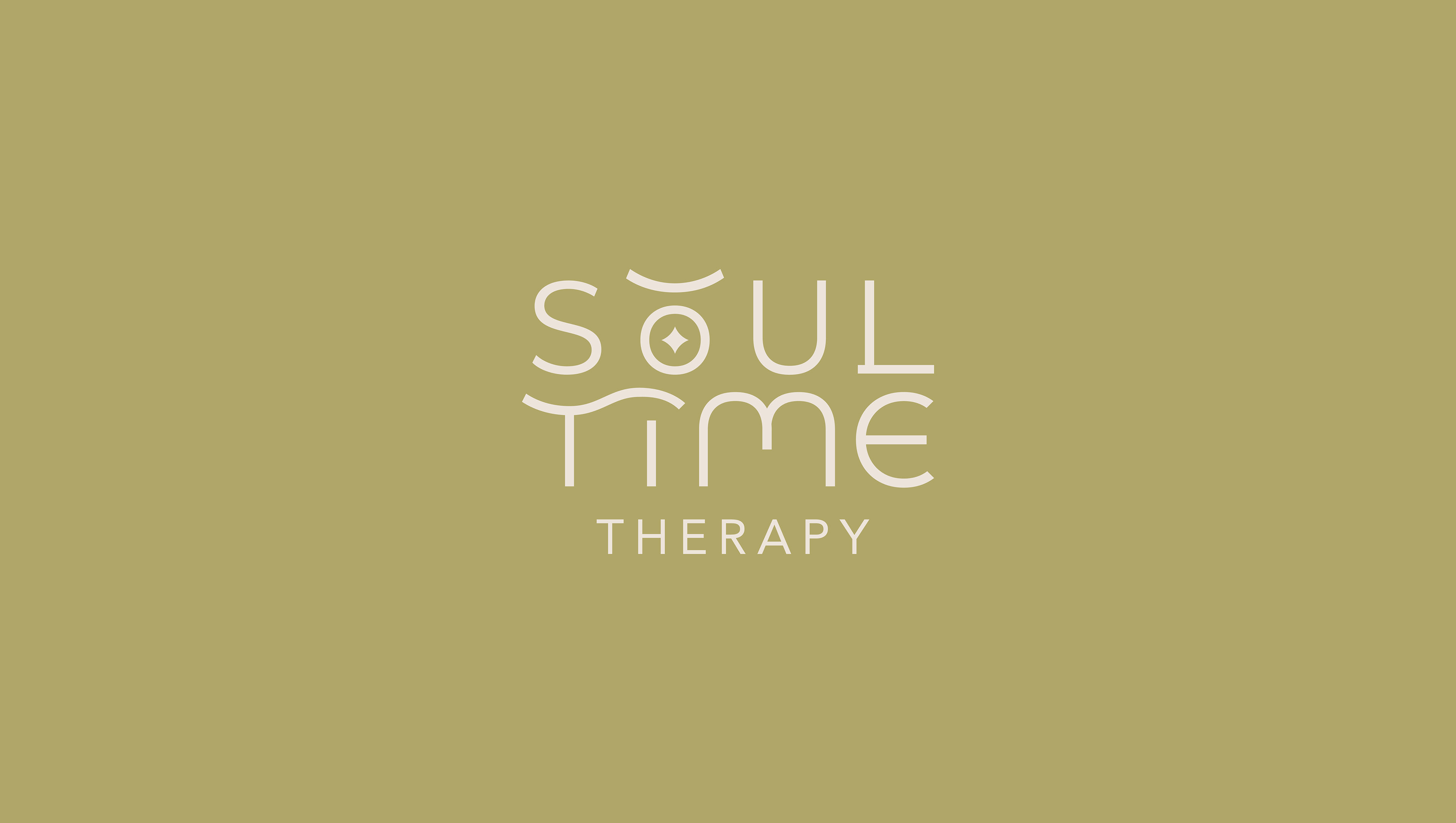
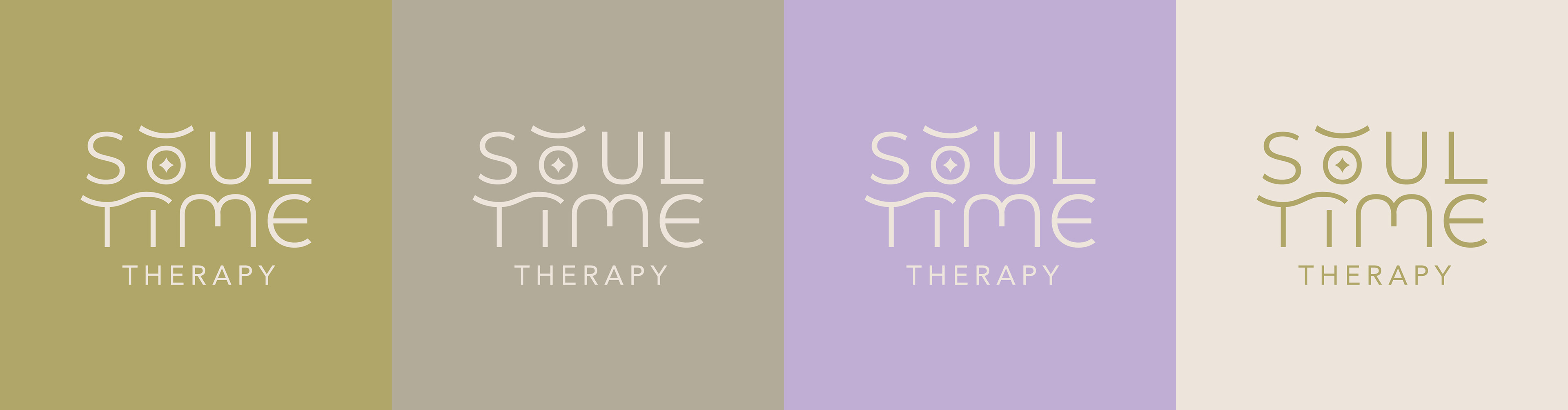
Focussing on the connection with the mind and soul, I took reference to 'hovering hands' with the dash over the O. The clean typeface brings modernity and extended T allows for lying down body shape. Without the letters actually touching, this is more about the spiritual connection and how the letter forms work together.
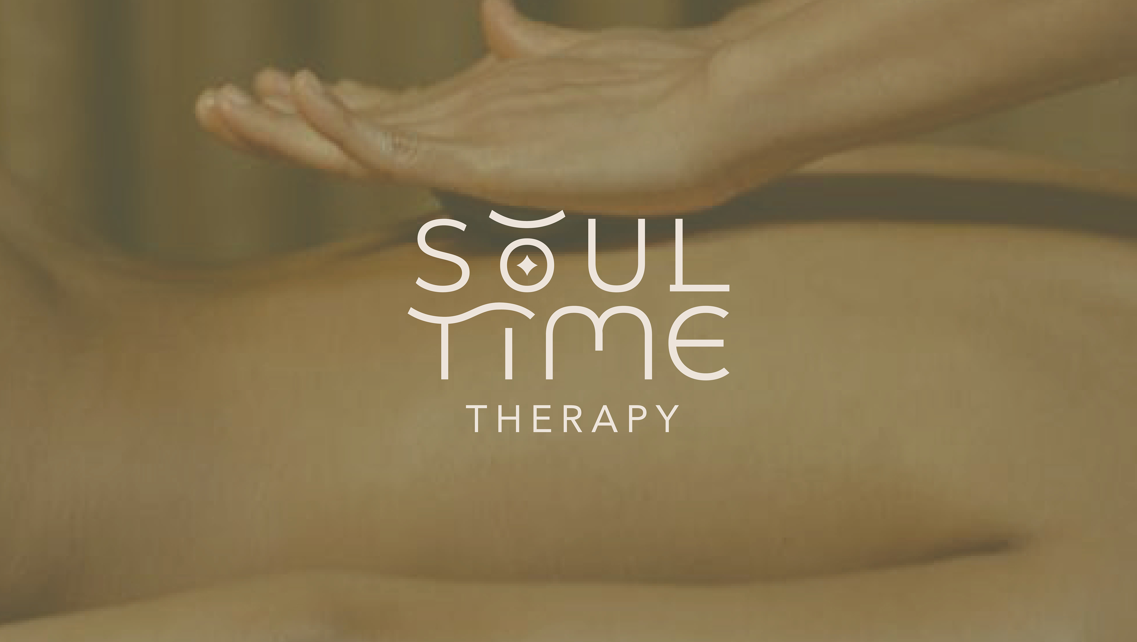
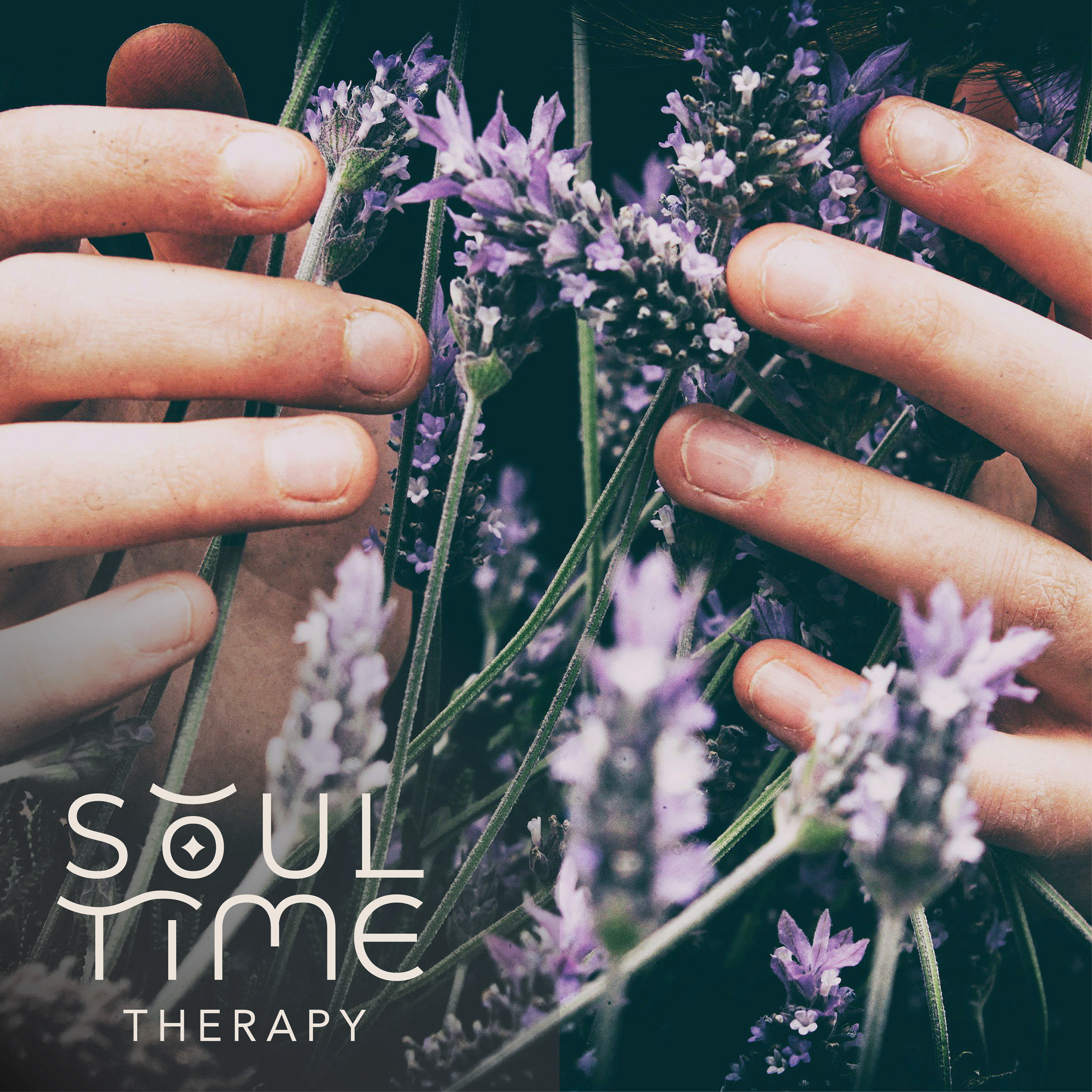
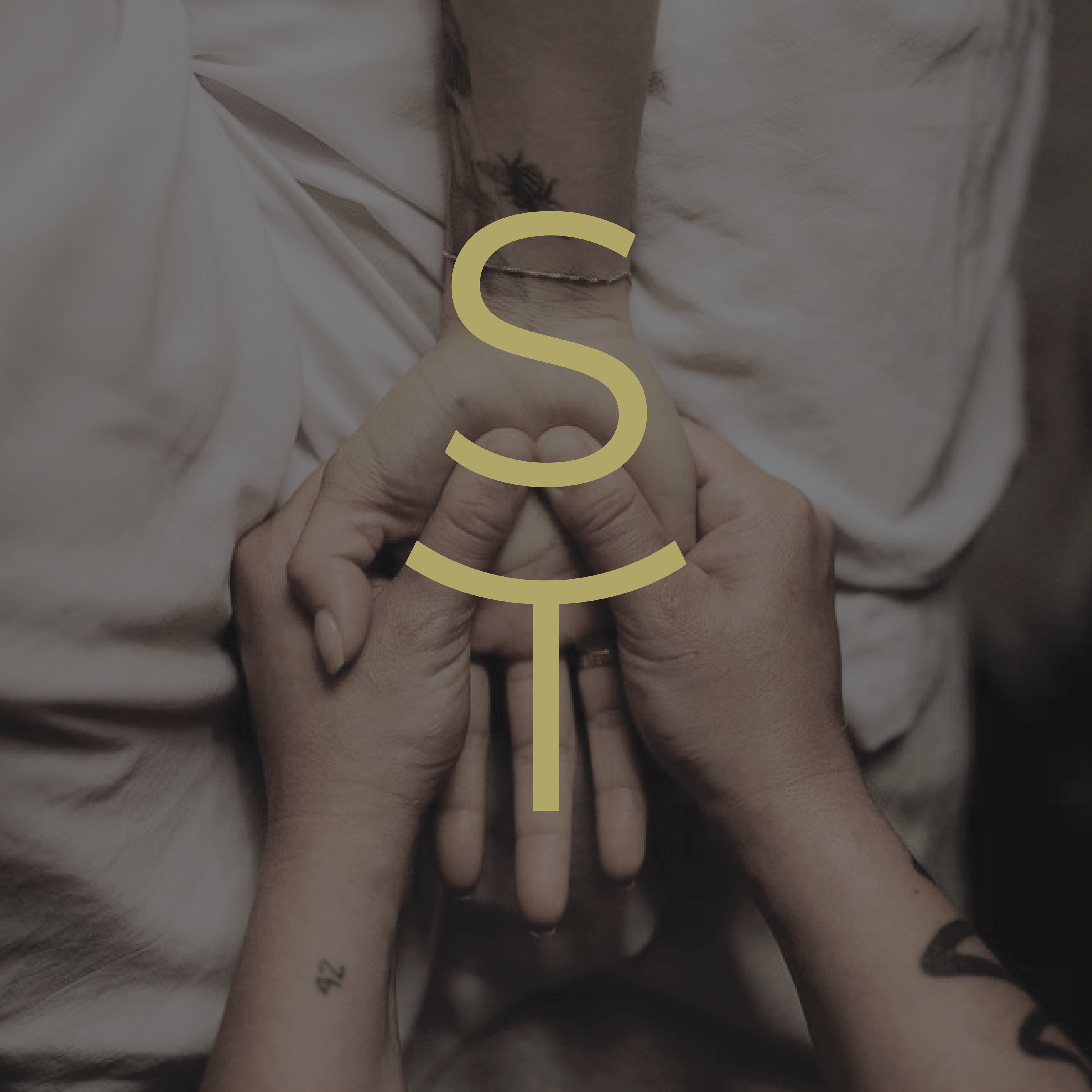
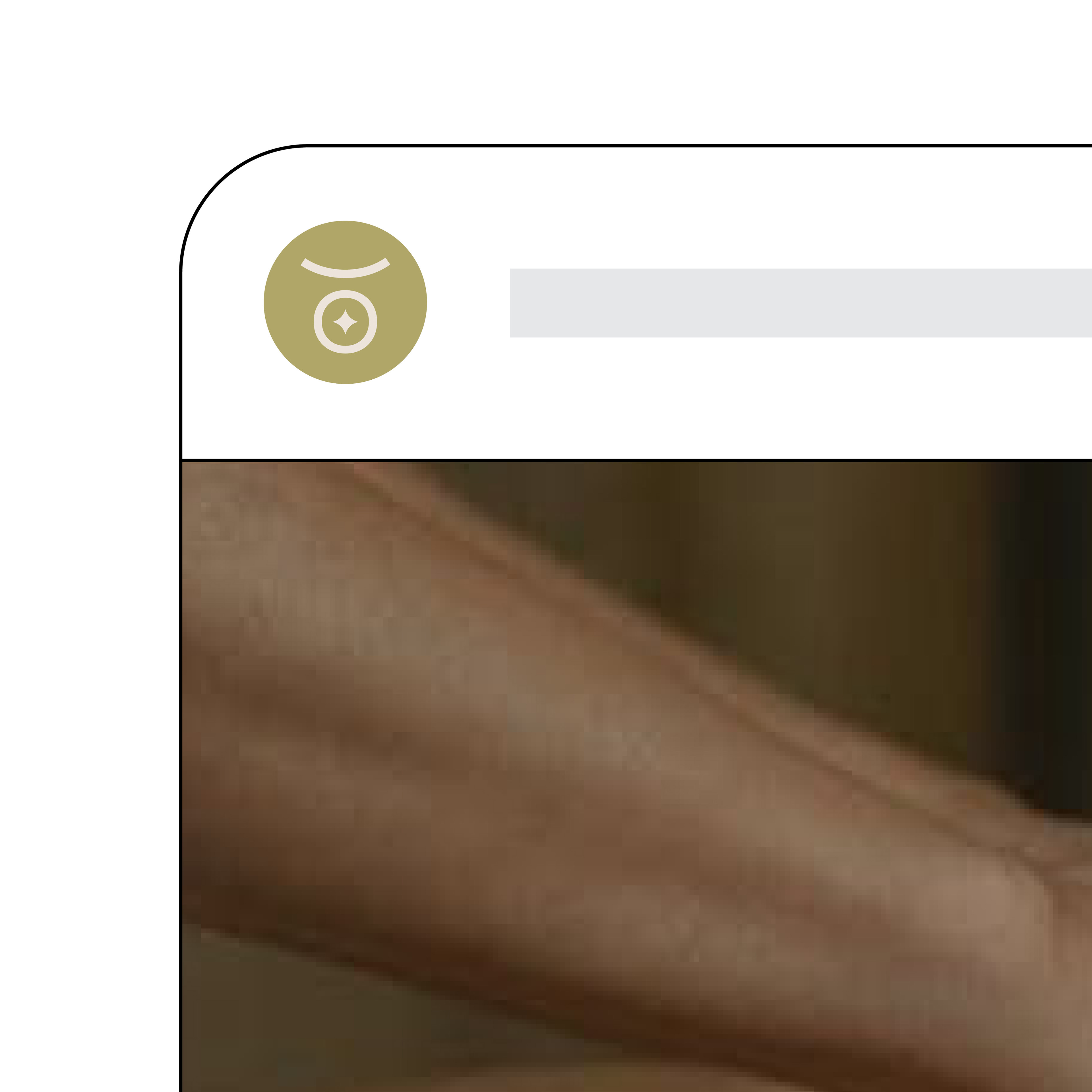
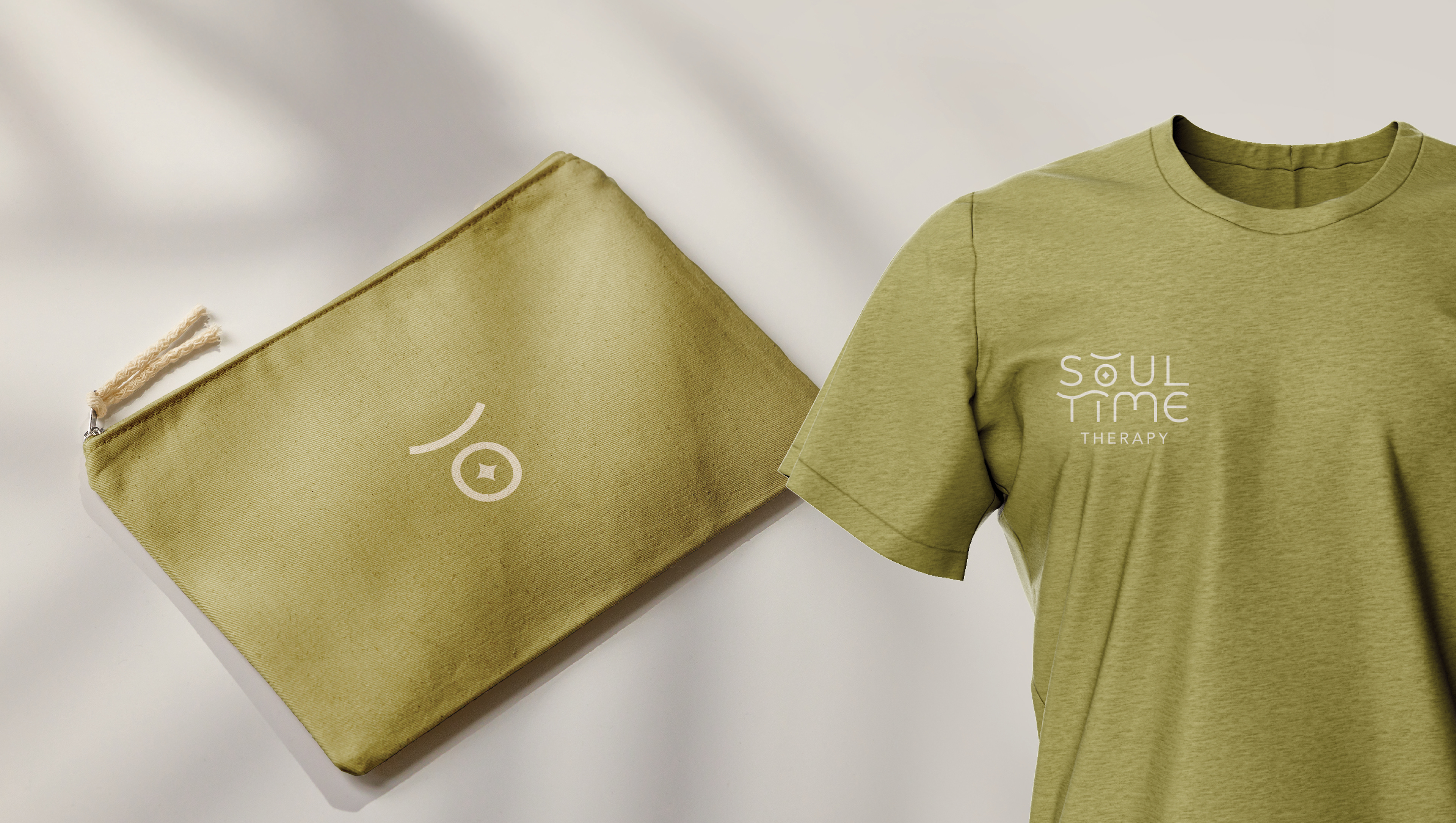
Adding to the brand elements, the S and T can be used separately and overlaid over imagery. It also represents a complicated mind “S” over on the shoulders “T”. The logo suite is adaptable for a range of uses such as favicon's, 'stamps', and image tags as well as uniform.
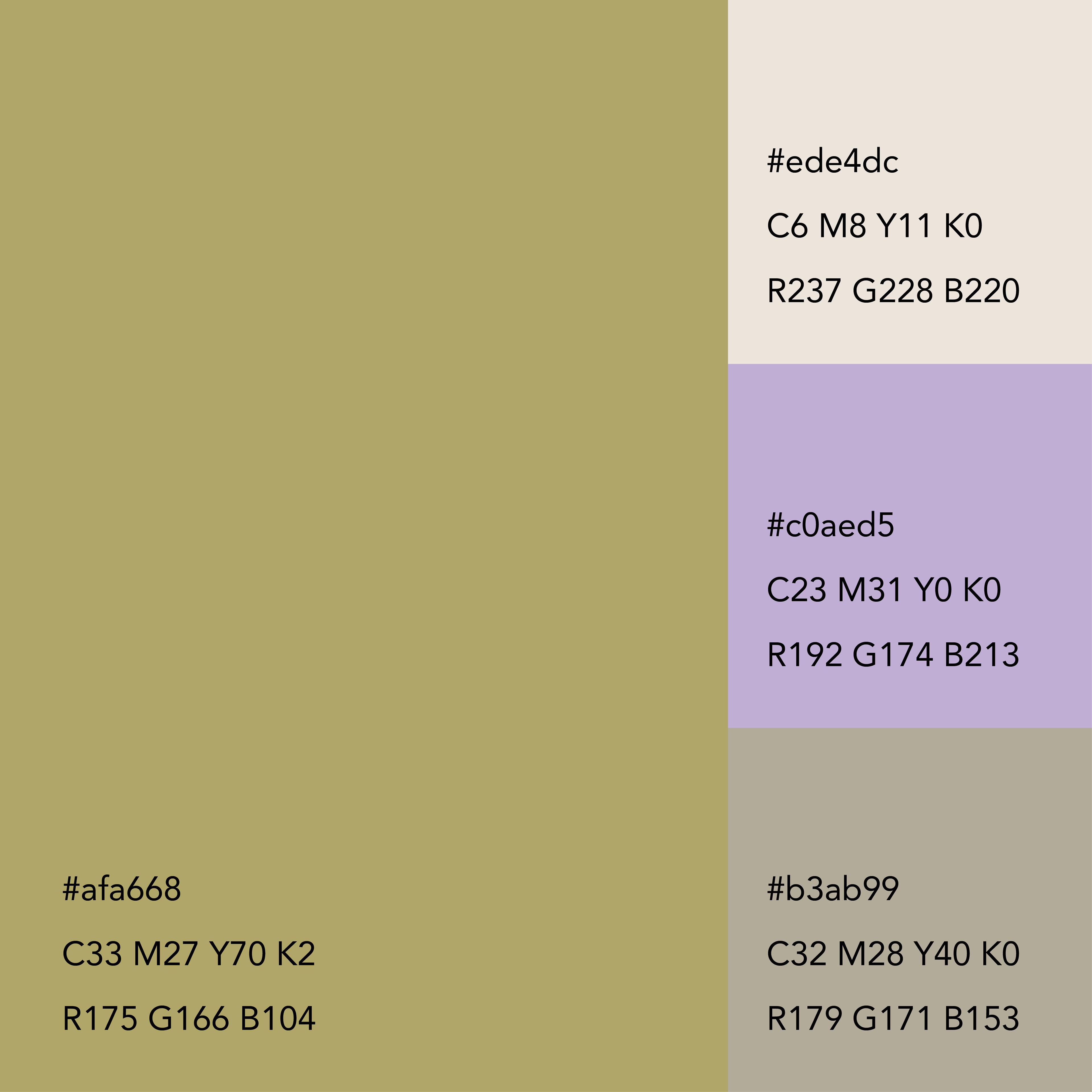
Creating a calming pallet was also imperative to this project - with green being the common colour used for mental wellbeing and the client liking the green concepts within the moodboard - this became the primary brand colour.
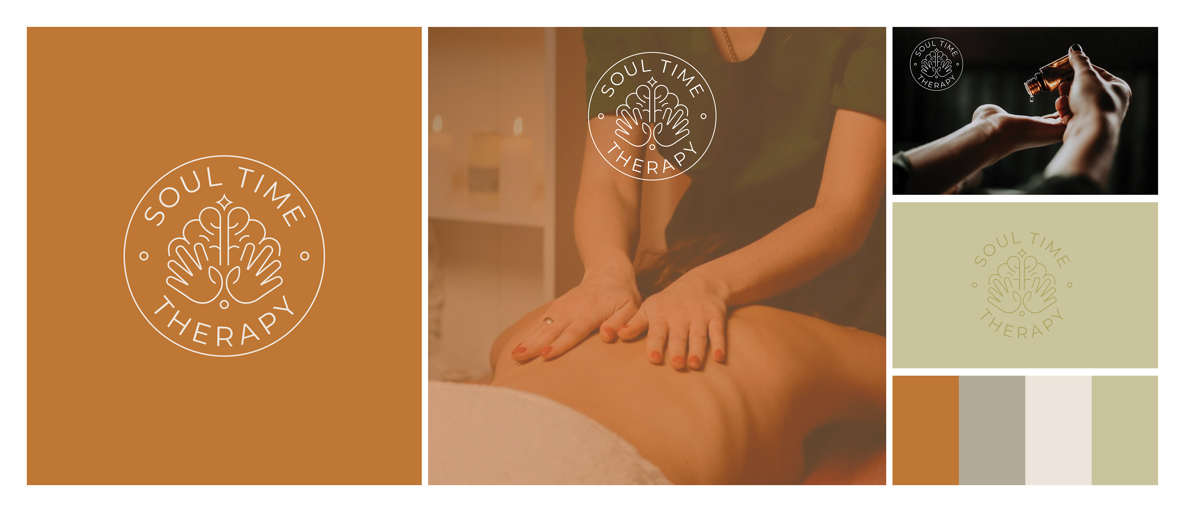
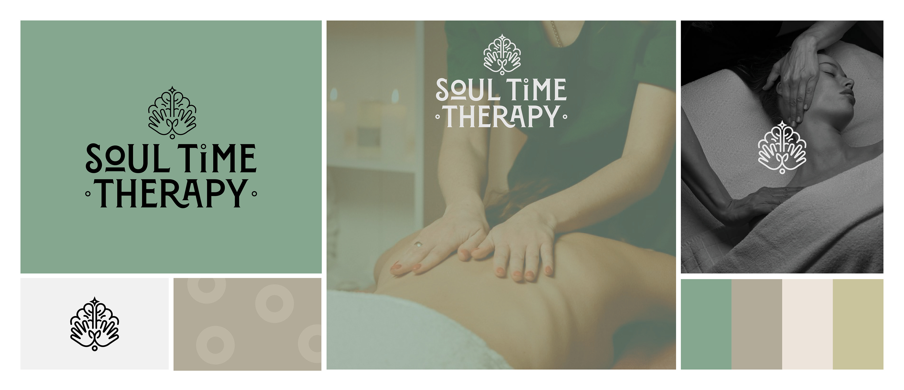
Below is alternative options presented. These focused on the hands and massage techniques as well as incorporating the brain for mental health references. These could be used as a 'stamp' over imagery for social media or use logo shapes to contain imagery or create patterns.