The Brief:
To respond to the sentence ‘Hashtag Follow Me’ in any way we feel appropriate.
The Approach:
To approach this brief I focused on the details within maps and navigation. I produced a newspaper documenting short stories of holidays I’ve been on in the past and pairing them with images I’d already taken in previous years from my Instagram feed. I decided to limit myself to black and white and this became the name of the newspaper with a white insert: a photographic insert of white named places surrounding my hometown. I also made postcards which use the header pages from each story.
Amsterdam Spread
A Personal Challenge
After using vibrant colours for many of my projects, and even writing my dissertation on the effects of colour, I wanted to challenge myself and work with only black and white. By the end I had a new appreciation for the simplest of colours and how to use a monochrome pallet.
Rome Spread
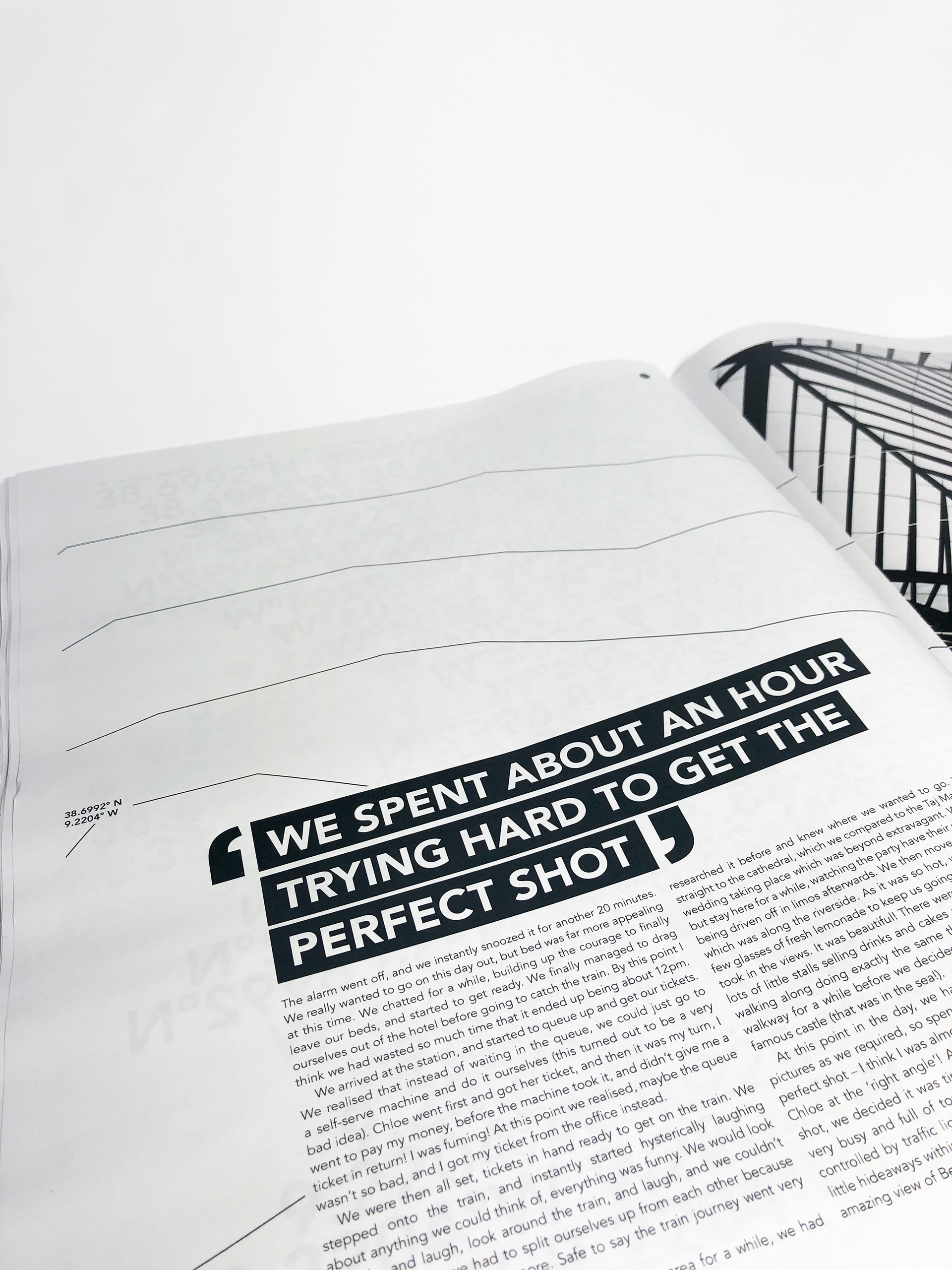
Where big speak marks are used, the article is written from another person on the trip. This gives context throughout the newspaper and allows the reader to follow the narratives.
Contours
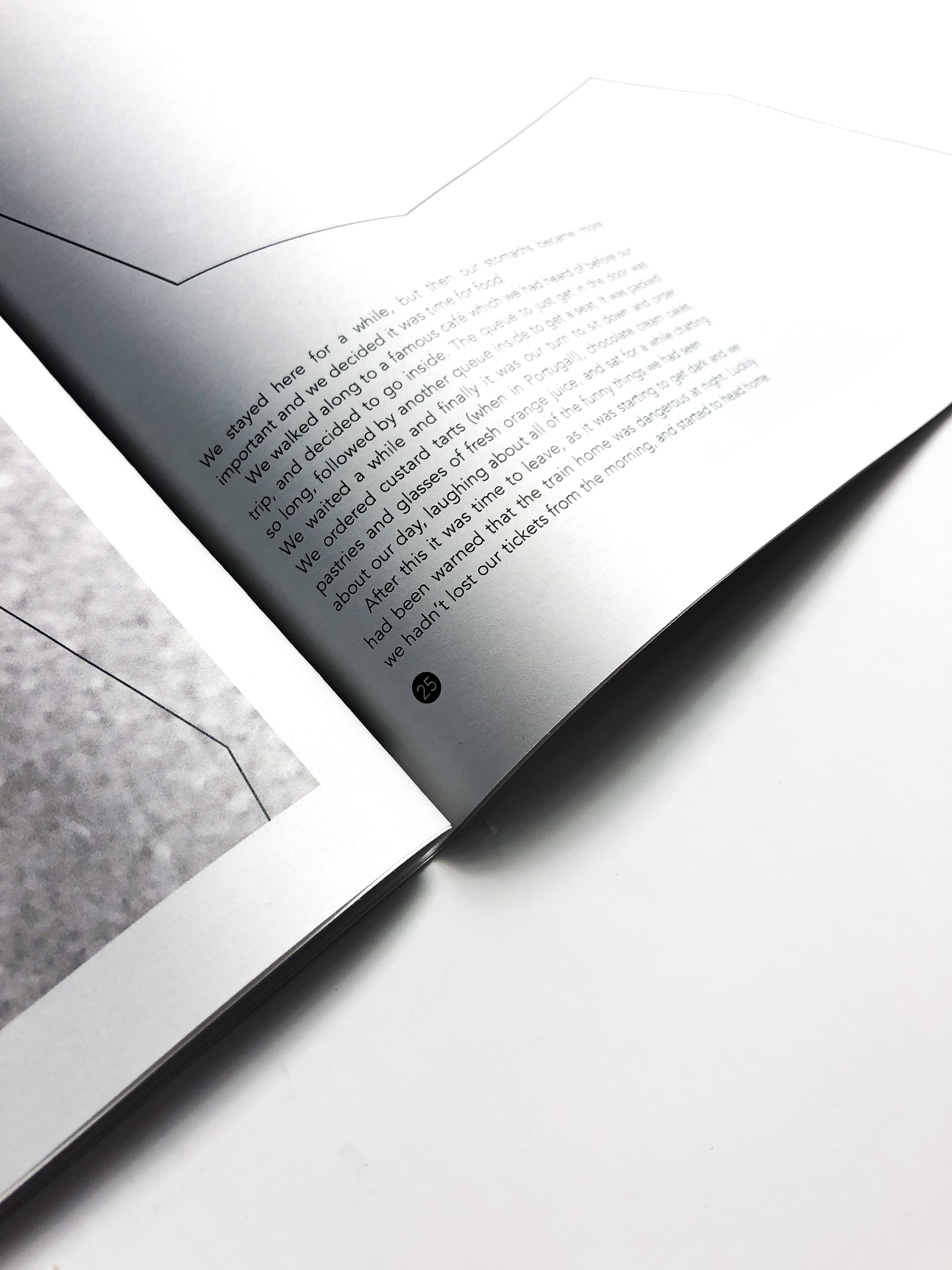
Contours in the background of every page are used to align the newspaper with navigation and map reading skills. The contours from each page make up a large map of Minehead, my hometown. Despite documenting different places of travel, Minehead is therefore always rooted in the background. The page furniture also reflects map coordinates and the date of travel, documented in chronological order.
Switzerland Spread
Lisbon Header Page, Chevron pattern to represent the blankets and throws, iconic to Portugal.
New York Spread
The Online World
To relate back 'Hashtag' and the online world of categorising things, next to or on every picture is a circled number. This number represents how many likes the picture received on Instagram or Facebook when it was first posted.
Israel Spread
Lisbon Spread
The Header Pages
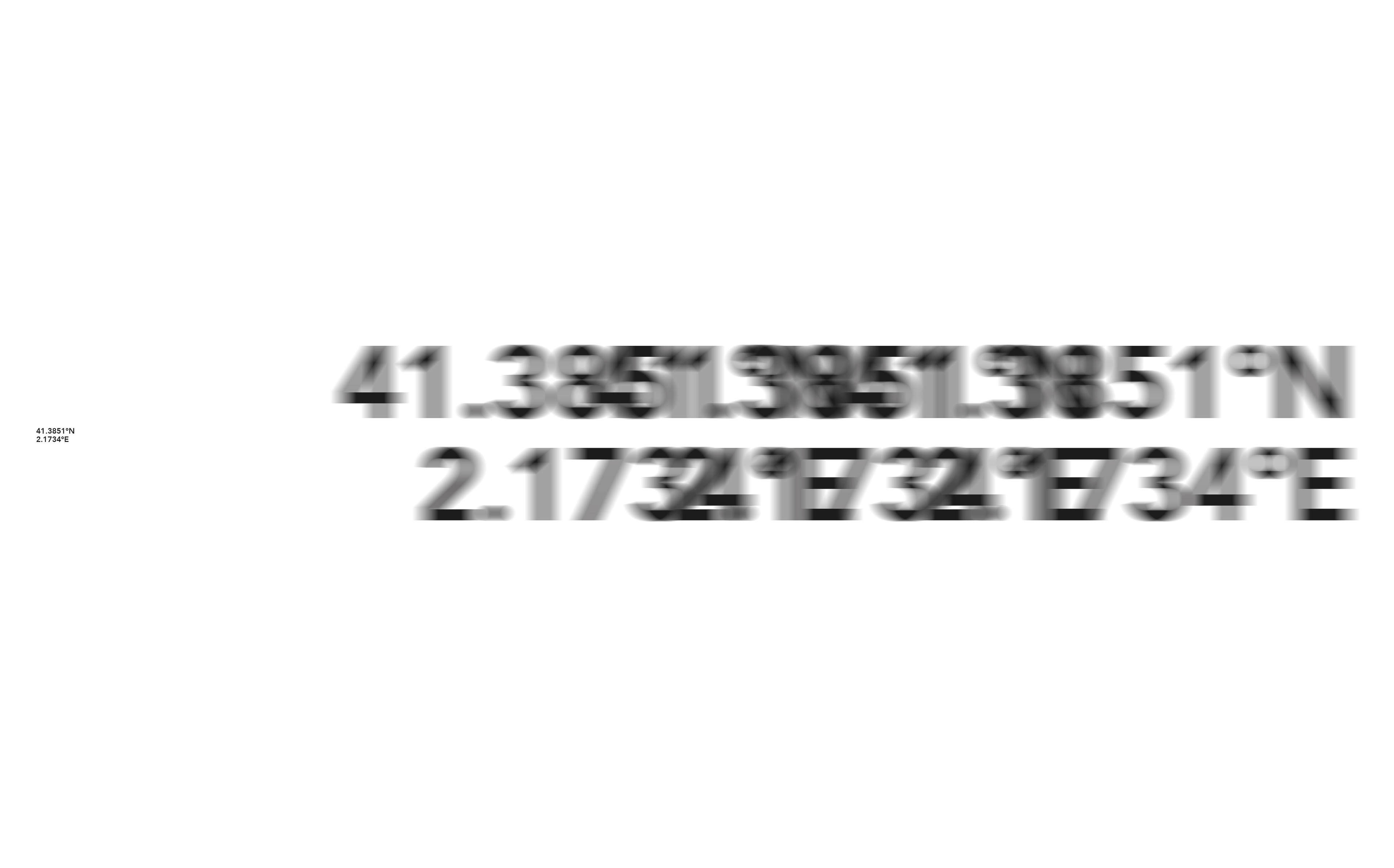
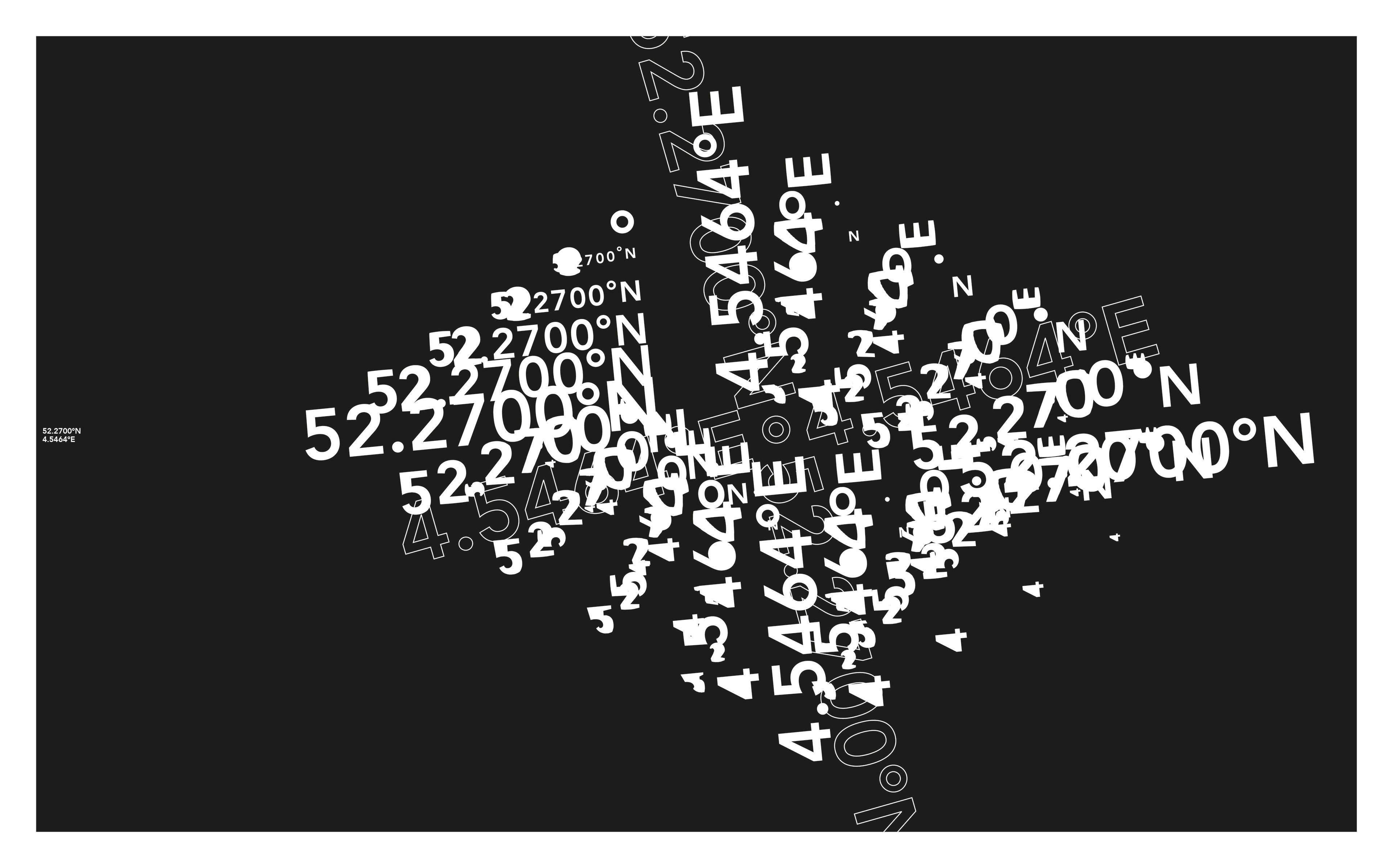
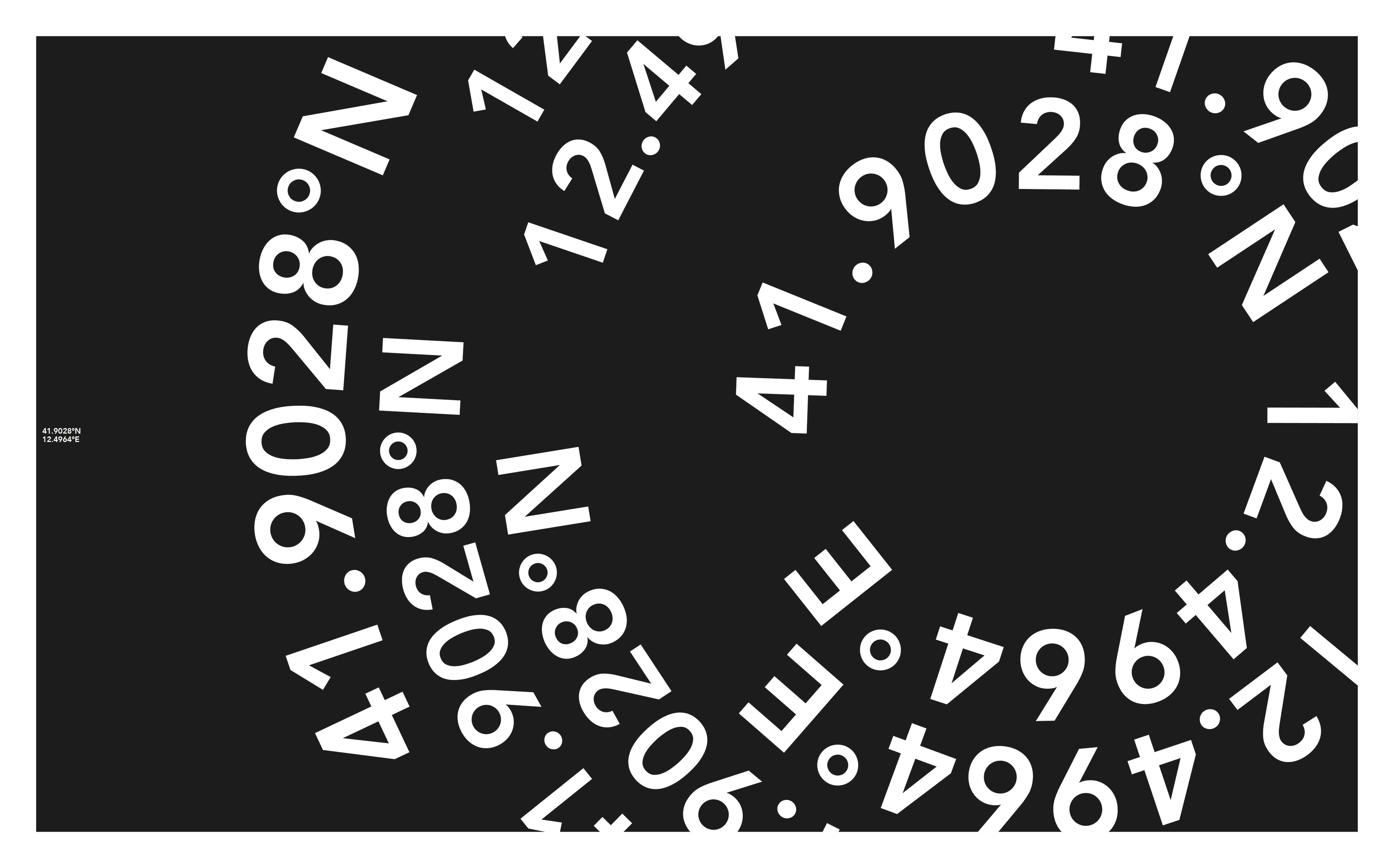
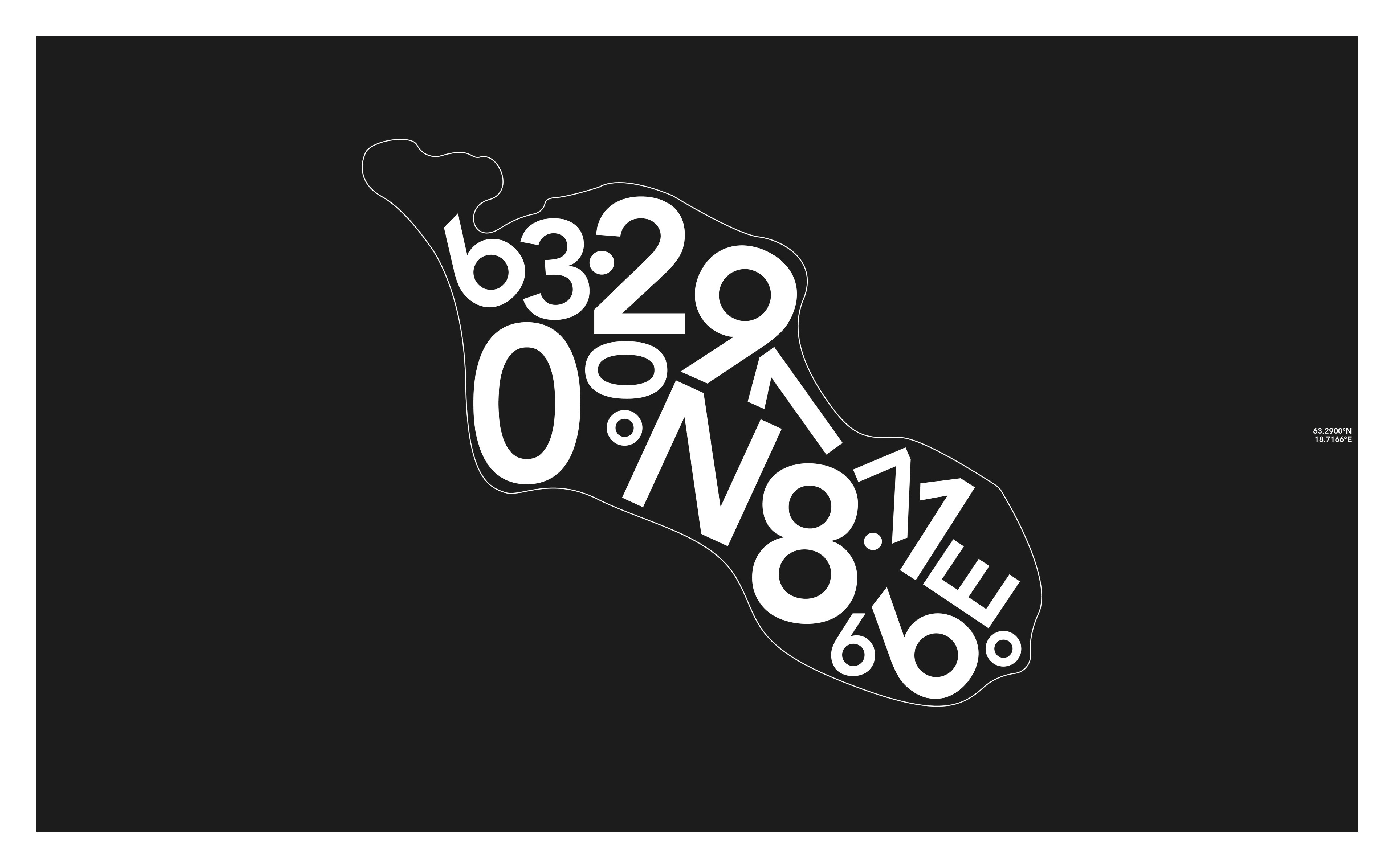
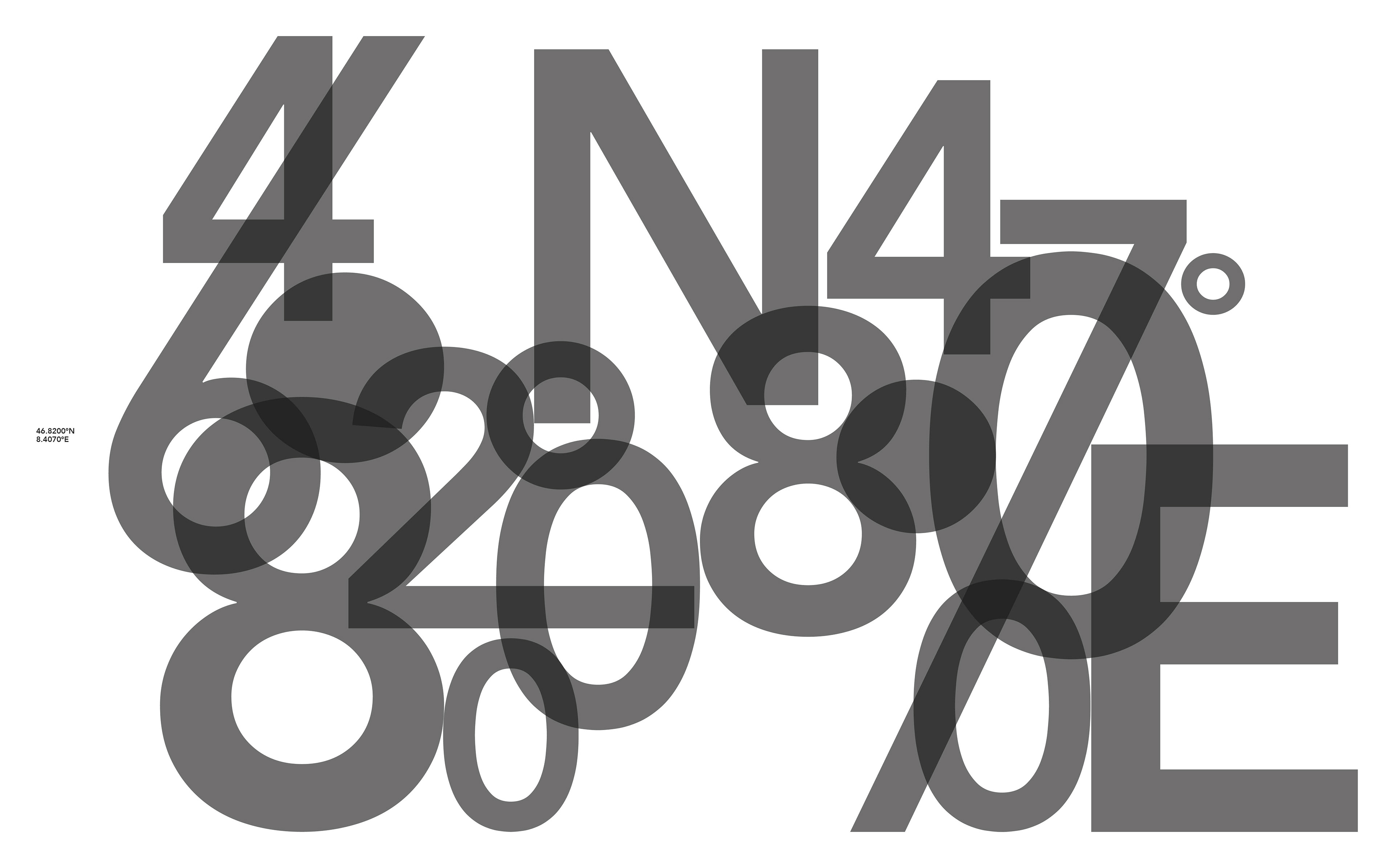
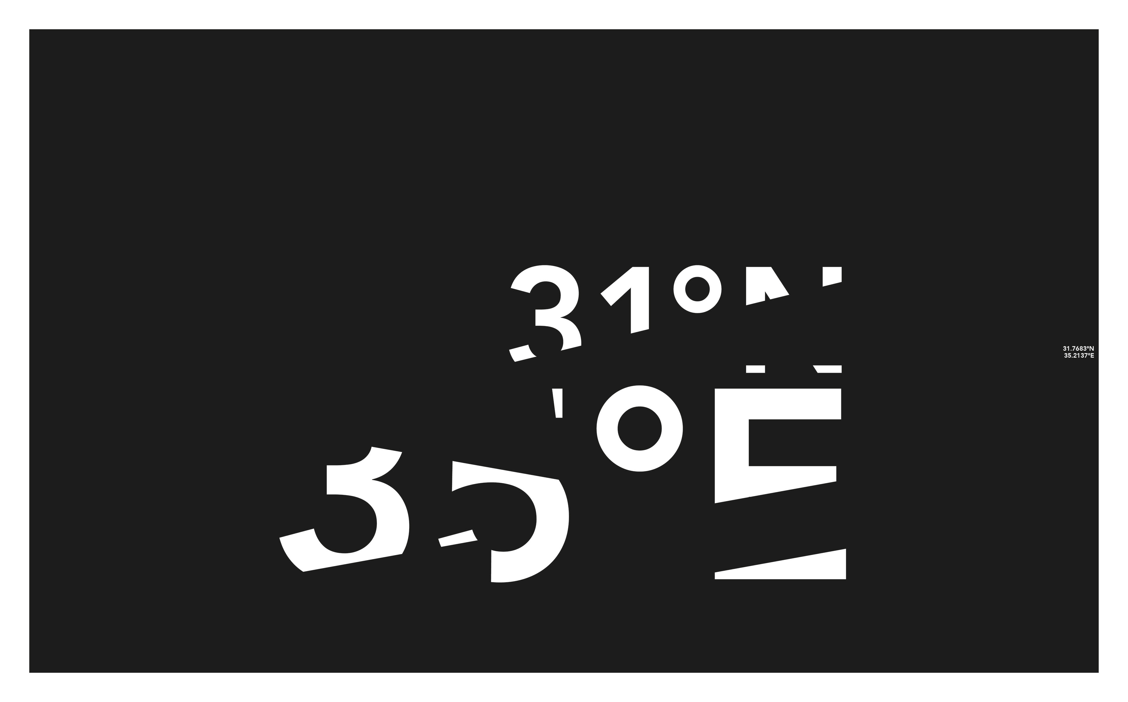
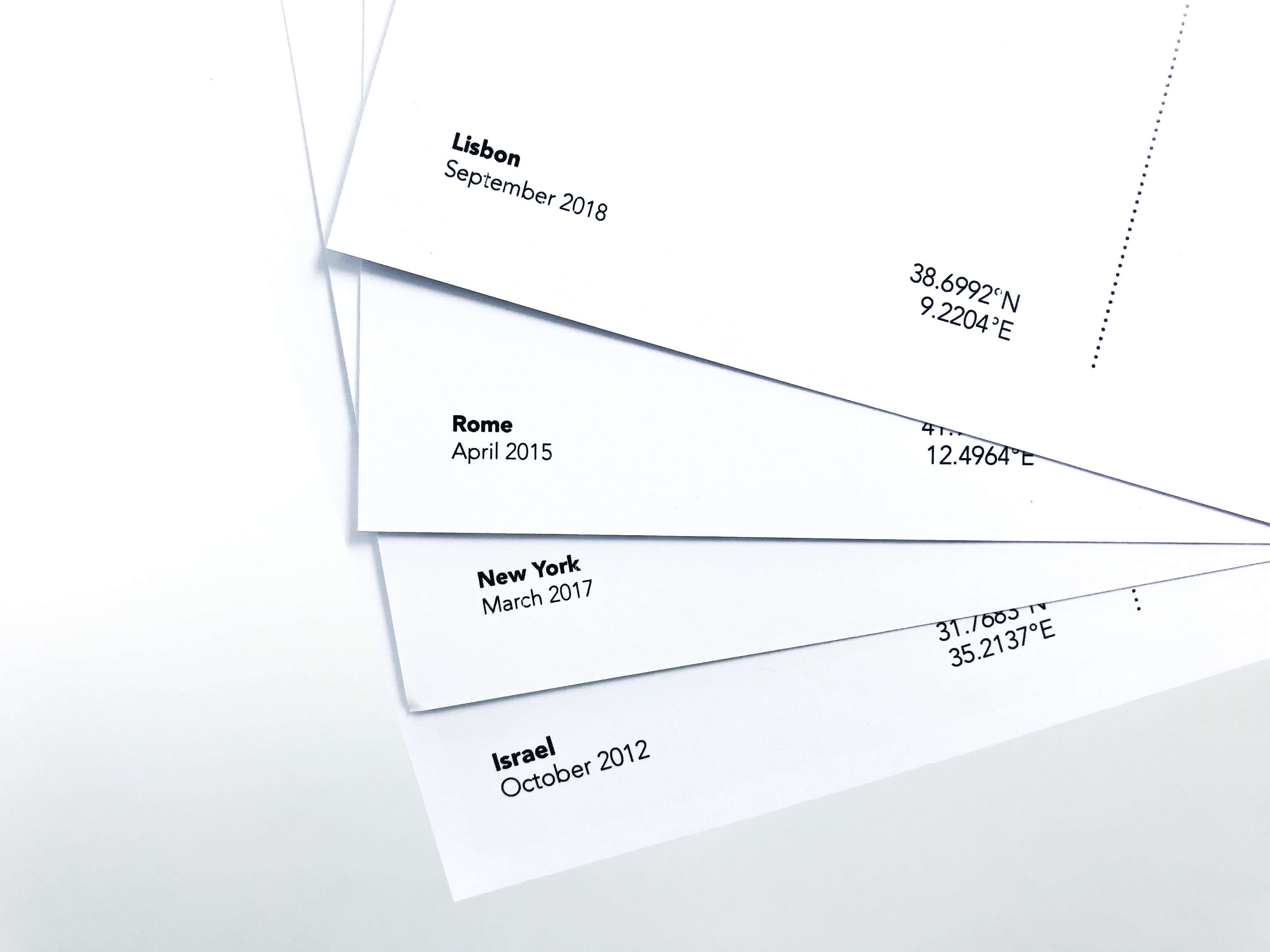
To differentiate between different destinations, I used the coordinates of the country, city or place visited to introduce a new article.
These header pages represented something about the trip or the country, for example; Rome is represented by circles of coordinates to nod to the Roman Colosseum, while Sweden is represented by coordinates within the outline of the lake I used to walk around. Amsterdam is represented by a windmill shape, where the coordinates make more of an abstract pattern and sense of movement.
On every page of the newspaper the coordinates sat anchored to either side to act as additional page furniture allowing differentiation to each article.


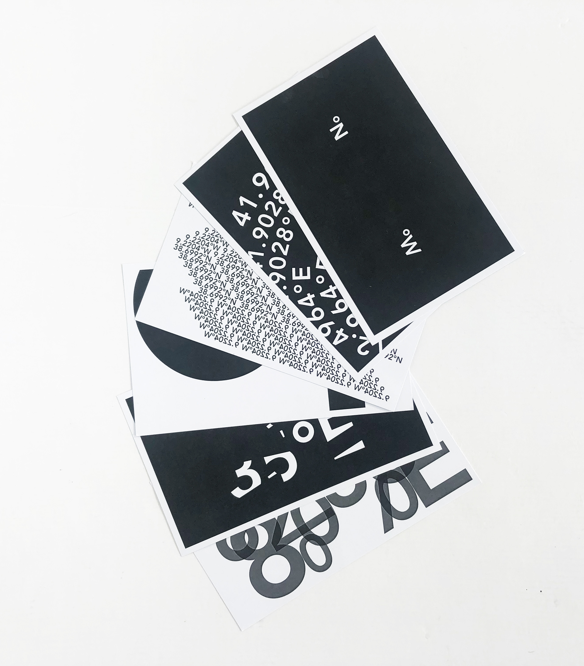
Postcards
To extend the project I made postcards out of the header pages as a typographic alternative to a usual picturesque image representing the area.
& White
An A5 photo insert that captures all the 'White' places across a small area of Somerset. With White also being my Surname this had more relevance to the brief 'Hashtag Follow Me'. Taken at different angles to make the book have an interesting dynamic, I photographed all the images myself, thinking about the black and white composition.
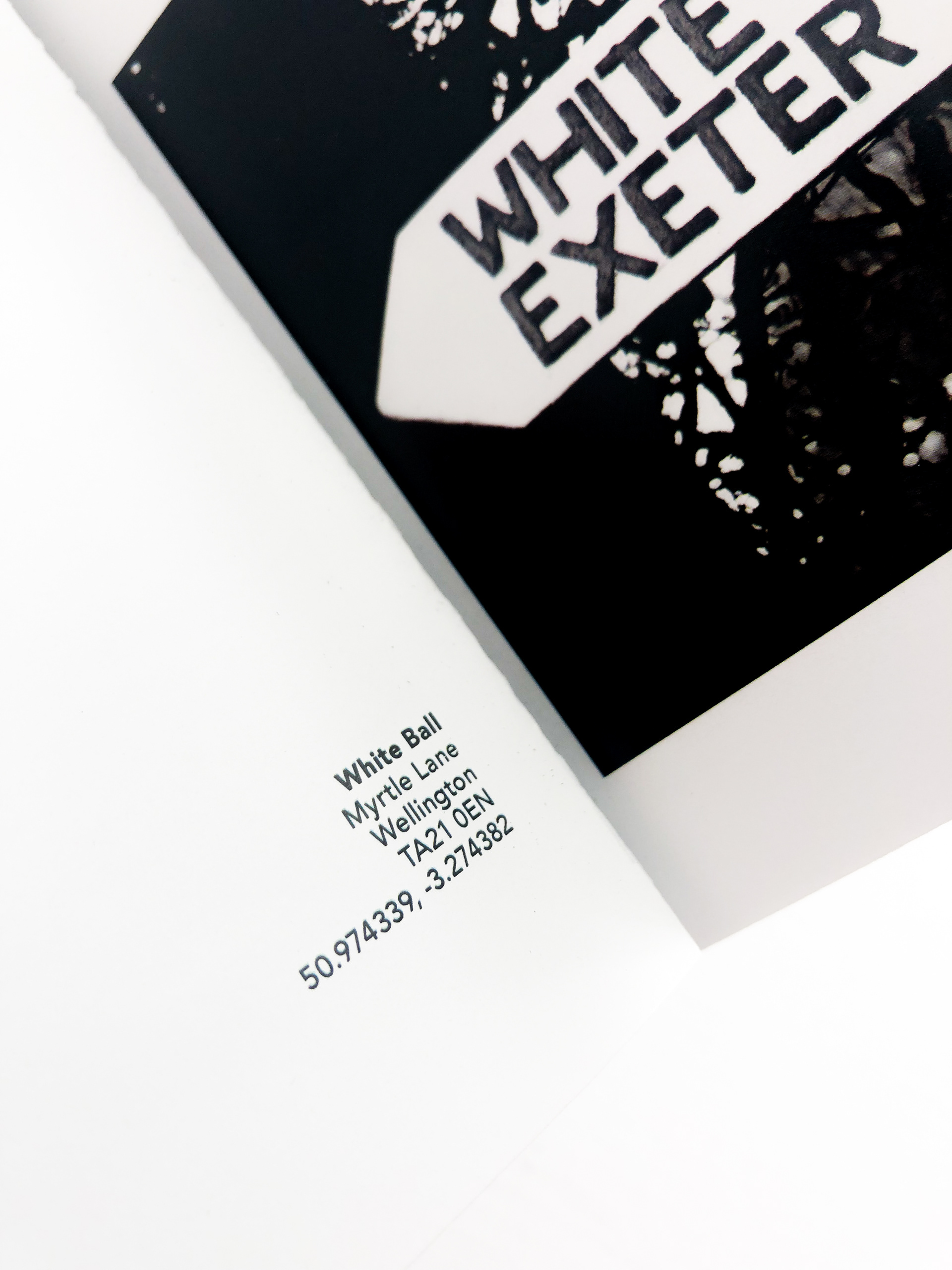
The images were then all captioned with the nearest town, postcode and coordinates of location to be in keeping with the newspaper.
White insert, cover screen printed using pure medium to get an invisible shine finish.
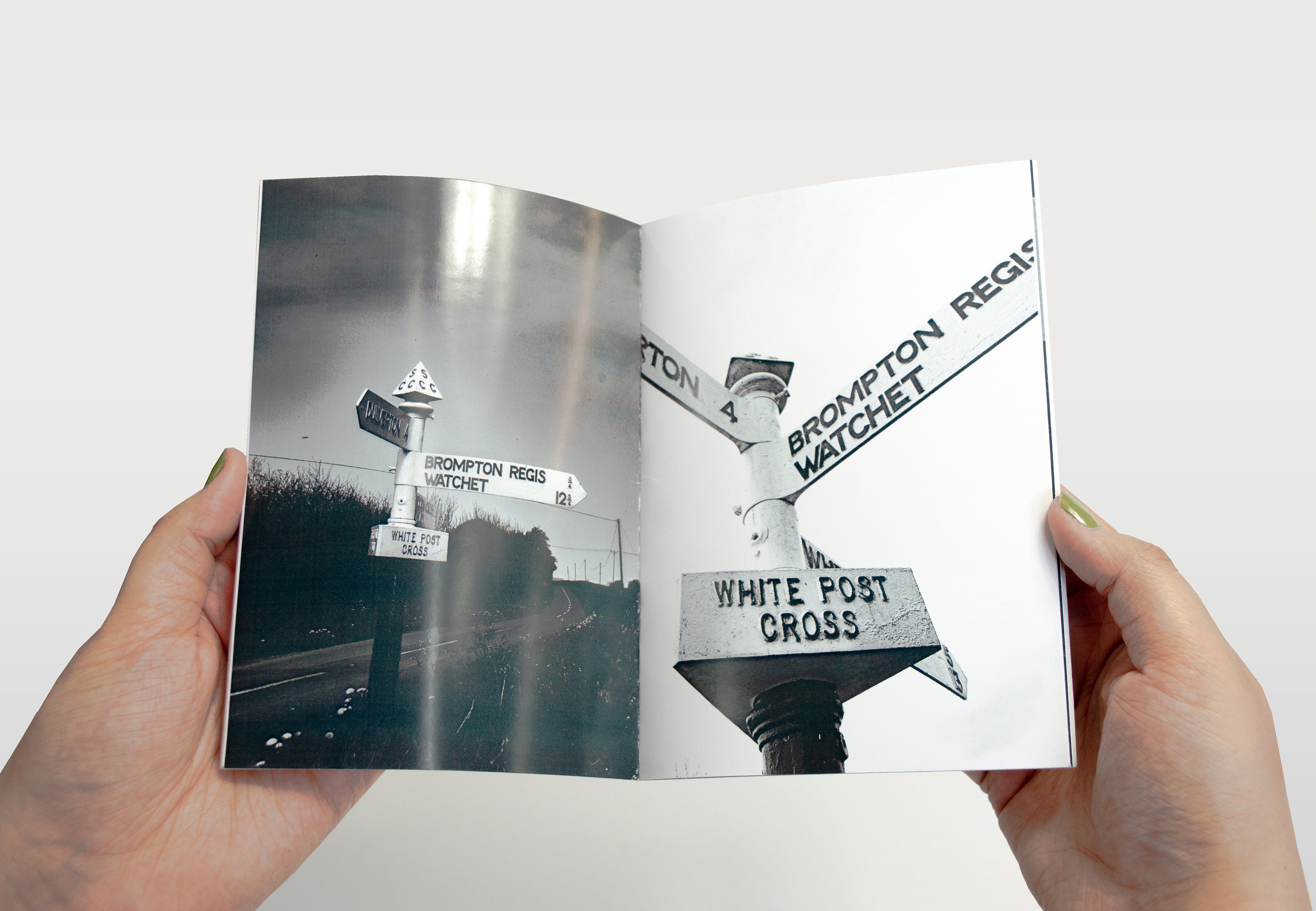
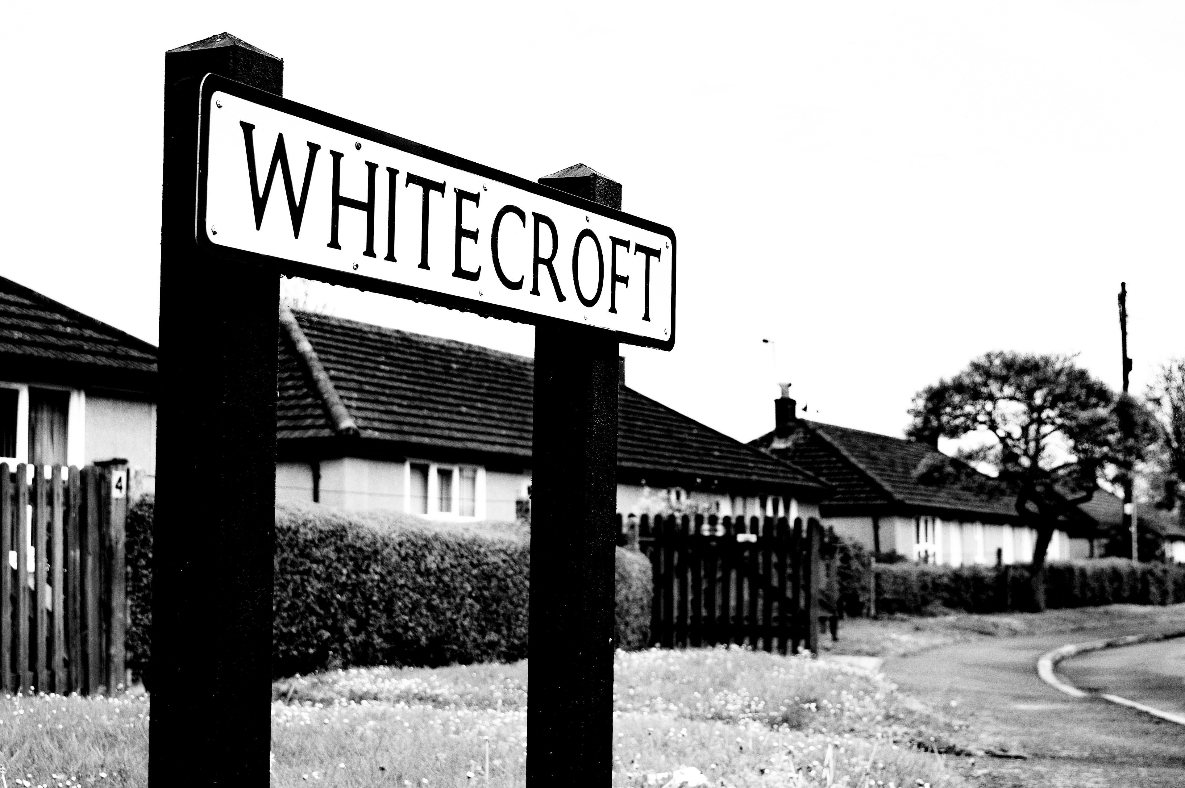

Black and White photography of 'White places' around Somerset.
